This is a continuation of my project started in this post.
Day 6. Everlasting Fold Book
-

- Outside
-

- Inside
-

- Open
-

- Close-up of Spine
-

- Pages removed
-

- Slipping pages into case
-

- Source Book
This book is called “everlasting” because the accordion-folded pages can be removed and replaced with with fresh pages when you are finished with them. It’s a clever idea, but I wish the spine were sturdier. I have a feeling that the pages will last longer than the case! I used the plain yellow on the outside because I was confused by the instruction as to which paper would be seen. If I were to make another one of these, I would try to figure out how to create a stronger spine, while retaining the ability to remove the pages.
Day 7. Foldout (map) Book
-

- Outside
-

- Open with map folded
-

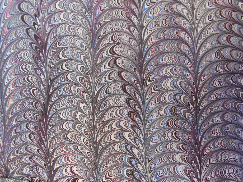
- Map
-

- Map unfolded
-
- Source Book
When I saw this design, I knew immediately I had to use one of my marbled maps for the text. It’s a good structure for any oversize piece that can be folded. If I make another one, I will marble the back side of the map with darker colors so the ads on the reverse aren’t quite so jarring. I might also add a ribbon tie or some other sort of fastening.
Day 8. Double Pamphlet Book
-

- Double Pamphlet
-

- Spine, showing V in cover
-

- Top
-

- Printed letterhead down
-

- … and up
-

- Tied closed
-
- Source Book
This is a nice sturdy little book that would be great for notes, grocery lists and other memos you still keep by hand and not on your phone. It it sewn with a pamphlet stitch through the two sections. The outside thread is hidden in the V fold made by the cover between the two sections. For the textblock, I used some letterhead paper that I liked, but could never use. I have several more packs that you may see in future projects! I like this variation on a very traditional structure. It is solid, compact and useful.
Day 9 & 10. Star Book.
This book gets two days because it was more intricate than I thought it would be. I worked on it for three days, but some of that was drying and pressing time so I decided to call it two. Hey, I’m making up the rules as I go along and there are no grades at the end.
-

- Star Book


-

- Source Book
This is an interesting structure that could be used in many different ways by adding text, graphics, cutouts and more. Unlike many other star structures which are accordion folded, this uses individual pieces which are glued at the points. That’s why it took more time than I expected. Each of the solid-colored papers was cut into seven different-sized rectangles, folded and glued. More labor-intensive, but more stable. At some point in this challenge, I will try one of the folded star books for comparison. The darker blue pages are folded on the top edge, except where I messed up, and can be flipped open a page at a time. I can see a graphic artist using those in all sorts of ways – to hide text or artwork, as pop-ups, for individual poems or as pages in a longer narrative. One could even have text or art on the purple pages that could only be seen through an opening in the blue page. Unfortunately, as I said before, I’m a structure person.
I’m planning on going on until Day 15 is finished and then taking a break. I’m going back to the John C. Campbell Folk School for another course and need to take time before then to batten down the house, finish turning over the garden and generally prep for the cold weather that is coming. Life does interfere with art sometimes. I hope to be back to 30 in 30 by the end of October and blogging about it soon after.