
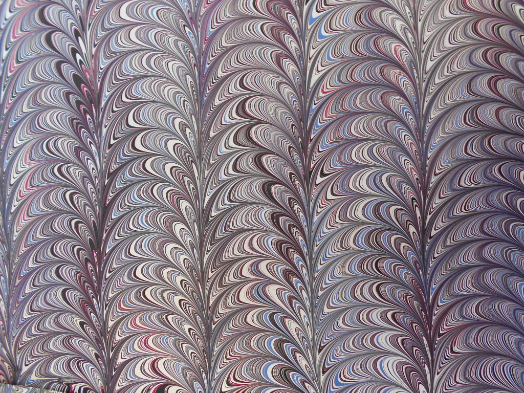
Last February I blogged about using metallic paints. Since then I’ve played with them a bit, but a few weeks ago I decided to do some more playing and experimenting. I’m finally getting around to writing my promised blog. This time I didn’t waste any effort on white paper and only used dark colored backgrounds. Most of the paper had deep rich tones to set off the metallic. The only metallics I used this time were gold, copper and pearl.
Here are some of the results:
-

- Group shot
-

- Too much going on
-

- Still a little too busy
-

- Medium detail
-

- Aqua and metallics on dark card stock
-

- Getting there, but lines a bit stretched
-

- Some granulation of the copper
-

- Aqua and pearl
-

- Good combination with large areas
-

- Almost too large, but striking
-

- Very nice balance
Here’s what I’ve learned. The metallics need to be dropped near the end of the sequence to have the biggest impact. The more they are manipulated, the more they tend to fall apart, but dropping them last can lead to globs that are too large. Next-to-last seems to be a good place for them. Some, like pearl, can be dropped earlier as it “stretches” without granulating. Metallics show up more if dropped with colors that have a high contrast, for example dropping gold with purple, rather than yellow.
I love making marbling patterns that are very intricate and fine-lined. This doesn’t work as well with metallics. They seem to need larger areas to turn from orange to copper or grey to silver. I don’t particularly like a lot of shininess in my work, but I do like just a hint of something, like the hidden sparkle of a bit of mica hidden in a dull stone rather than the brilliance of a cut diamond. In the past I used Golden color called “Micaeous Iron Oxide” which does just that.
Here’s an example
Large Black
All of the paints I’ve been using recently are Golden fluid acrylics. I really like the intensity of color they provide. Just this past week I visited the Golden factory which is located in a very rural part of upstate New York. The trip was organized by the Penn Yan Art Guild and there were six artists who participated. The history of Golden is very interesting, having been a family company and is now owned by its employees. We were given a tour by Emma Golden, granddaughter of the company’s founder.
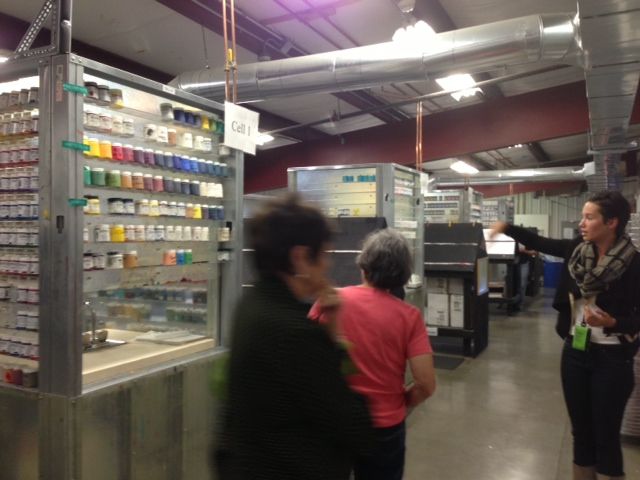
This is the area where all of Golden’s color cards are hand painted. Employees walk up and down the black easels painting one color on dozens of cards at a time.
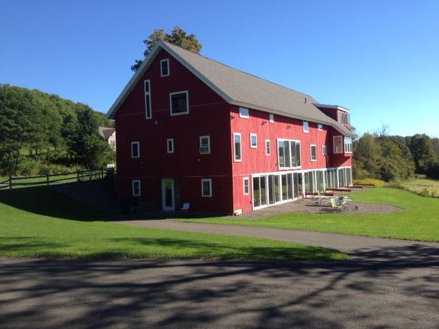
This is an old barn that has been remodeled into housing and studio space for the Golden Foundation‘s Artist program. It’s a beautiful location.


