Yearly Archives: 2015

Update on “How to Marble Paper” page

Three years age I wrote a “How to Marble Paper” page. Since then I have had lots of questions and and I have changed several of my methods. I am currently updating the page. Here’s the first part. You can see the whole thing HERE.

Update to How to Marble

The most frequent questions I am asked are about the basic physical components of marbling – alum, carrageenan, paint and paper.  I haven’t changed the first two at all. Marbling carrageenan (not the food variety) mixed at 2.5 Tablespoons per Gallon of water (I use distilled, bottled) and marbling alum (again, not the food kind) mixed at 1 to 2 teaspoons per cup of water. I mix my alum a bit stronger than some recommendations just because I find it works better for me. The carrageenan is mixed in a high-speed blender and allowed to sit overnight.  I usually mix the alum at the same time just because it’s one less step to do in the morning! The alum just needs to be stirred a bit to dissolve.

Paint
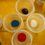
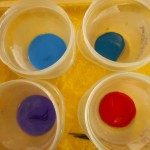
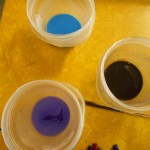
Paints can be tricky and you need to be willing to play a bit to find the brand and type that suits you purposes best. I have been converted to Golden’s Fluid Arcylics. I think they are easier to balance, have great pigment integration and provide intense colors. However, like all paint, they can be highly individual in the way you mix them. I start my paints with 1 part paint to about  1/2 part water and add water gradually to find the right balance. Colors vary a lot – blues & greens need more water, reds and yellows need less.  Unlike the paints I used to use, even the toughest of the Golden colors needs only 20 to 30 stirs to create a good suspension and most need way less.  I took a class where the paints had been pre-mixed and even though they were the same base paint that I use all the time, the water ratios were very different and it took a few papers for me to adjust my style to the paint. The moral is play, test, try and play some more until you find what suits you and how you plan to use your paper.

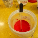
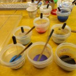
I use a piece of dowel to mix the paint.  It’s tempting to just use the eyedropper, but not wise.  I used to use plastic spoons, but find that the dowel provides a better surface for reintegrating pigment that has fallen out of suspension. Some paints, especially yellows and reds, rarely fall, but blues and ultramarines have to be stirred frequently.  Metallics need stirring before almost every drop and the dowel provides a pestle-like action that works well. I much prefer using cups to leaving the paint in the bottles. Bottles will develop a thick sludge of pigment on the bottom, but with the cups you can see and control the sludge formation. I’ve used both snap lid and twist on cups and prefer the twist closure. It gives a tighter seal and avoids the splash episodes when I try to open a stuck snap-on lid! You do have to take care that the twist is fully sealed if you are leaving the paint for any period of time.

Paper

What paper you use depends entirely on what you plan to do with your marbled paper.  Always keep end use in mind.  Most of my paper ends up in my books; that’s why I started marbling in the first place.  Therefore, I use a lot of drawing weight paper (70-80lbs, 100 – 130gsm). I also use a lot of card stock (65lb., 167 gsm.) for cards and for some book uses, but it is too heavy for endpapers.  I have some beautifully marbled sheets of very heavy weight paper and even watercolor paper (400 lb.) that I love, but have yet to figure out what to do with them.  Many marblers love Texoprint paper, but I am not a fan, partially because I don’t like the way it pastes down.  I have tried marbling everything from paper napkins to mat board. So try, experiment, play!  If you are just beginning, I suggest either a 70lb. drawing paper or card stock as they are both easy to handle and have many uses.

Fun sources of marbling paper are everywhere – discarded books, maps, old magazines, sheet music,  junk mail, community flyers.  Just look around.  Slick and glossy papers are harder to marble since both the alum and paint tend to slide off, but you can have fun trying!

…. Continued on THIS PAGE


11 Comments

Filed under Marbled Paper

Fox Boxes

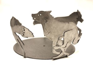
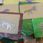
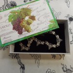
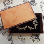
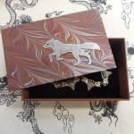
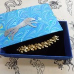
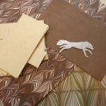
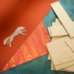
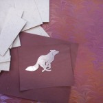
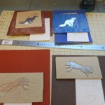
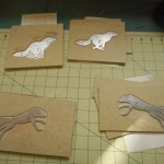
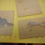
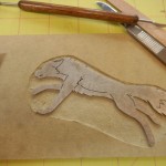
About a month ago I was working with Sam Castner on his Etsy page and found that we couldn’t list his stainless steel fox ring because there had been a glitch in production. These foxes and Sam’s other candle holders are part of his design for a spectacular set of gates for the Fox Run Vineyards as seen on his FaceBook page.    This is the steel version of the fox ring.Fox (1) I asked Sam what he was going to do with the unusable rings and he wasn’t sure.  Three days later I suddenly realized that the foxes were just the right size for some of my boxes and books, so I asked Sam if he were willing to snip some off and let me play with them.  He did and this is the rest of the story.
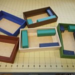
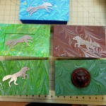
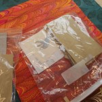
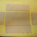
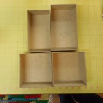
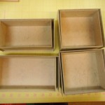
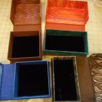
I started with some lidded boxes.  These boxes are constructed  in two parts, a bottom tray and a top. The top has a plinth attached that fits exactly into the mouth of the bottom tray.  It’s a faster and easier construction than the clamshell preservation box.  I had made the five bottoms before I started taking photos, but that process is straightforward and is just like the clamshell bottom tray shown in the second group of photos.

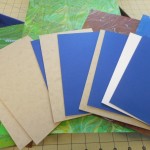
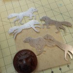
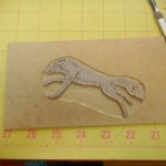
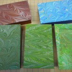
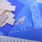
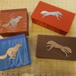
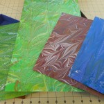
Design work is always fun and I tried to find pieces of my marbled paper that felt a bit like fox habitat, had lines that would flow with the shape of the fox and colors that showed off the stainless steel. After choosing the materials, I decided to make all these boxes the same size, which I rarely do, but it does make cutting easier.  I don’t like things that are just stuck on the top of boxes, so I carved down into the binders’ board to recess the fox pieces.  They aren’t quite flush with the top, but rest about half way in.  The exception is the light green box where I made a frame the same thickness as the fox.  I tried different shapes for the insert and found it didn’t matter much since there was so much pattern in the paper under the fox. The wooden lion was added in, as it was something I had been meaning to try for a while.  Seemed like a good time.  The plinths under the tops were covered with a variety of decorative papers that complimented the marbled paper and the bottom trays were lined with black velvet.

I was pleased enough with these results to move on and make some clamshell boxes. The design is based on the preservation box used by archives, rare book libraries and museums.  When I was working as an archivist, I made hundreds of these, not as artistic and not nearly as much fun!

First step is always design – choosing size, shape, colors, and materials. I never make it through in one go!  This time it was the dark brown bookcloth. It was perfect, until I discovered that I was down to my last piece and it was an inch too short for the box I wanted!  This was an easier problem to solve than when it’s my marbled paper that is in short supply.  Bookcloth can be ordered, my paper can’t be reproduced, even by me!

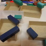
There are three separate components in a clamshell box: the inner or bottom tray, the outer or top tray and the case.  When making a box for a specific item, the inner box must exactly fit the item. I didn’t make these boxes for any specific measure.  The square boxes are almost the same size, but because I misread some numbers, the two long boxes are different sizes. The inner box is made first, then the outer box and finally, the case. The case is constructed just like the covers of a book with two boards joined together with a spine strip.  The inner tray is mounted on the inside of one cover and the outer tray on the other. I have to be careful that they are aligned correctly and the outer tray fits snugly right over the inner tray.

No matter how carefully I cut, there are always some pieces of board that aren’t quite right.  Sometimes they are too short or too long, but most frequently, they are not exactly square.  At least that used to be the problem.  I have three cutters that I use all the time: one I use to cut the big sheets of Davey board into manageable size, the new fancy one is for most of the paper, especially when I need 30 or 40 sheets cut the same size, and the last is an ancient Milton Bradley school cutter that I use for small to medium pieces of board.  I have known the Milton Bradley since the early 1950s and I’m pretty sure it’s at least ten years older than that. I was about to get rid of it when I realized it was the only cutter I had that could cut board exactly square and it was especially good on board that was under two inches wide.  So three cutters and I need them all!

After making and covering the trays, I move on to the case. When I am using an insert, the first thing is to decide on how it will be mounted. With these boxes, I cut down about half the thickness of the board and excavated an area for the fox. The case is then covered with bookcloth or paper and the trays attached to the inside. The final steps are mounting the fox on the top cover and lining the bottom tray with black velvet.

My fox boxes will be available in my Etsy shop and at ACYC very soon.

You can read more about Sam Castner’s metalworking and the future gates for the Fox Run Vineyards on his FaceBook page.

Direct link to Etsy shop

2 Comments

Filed under Uncategorized

Addendum: More Mini Books from Folk School Class

I knew I had more pictures of the mini-books and boxes made by others in the class I talked about in my last blog.  Here they are:  Enjoy the variety and colors. All of these are 3″ x 3″

Great books,  great class.  Fun times.

Leave a Comment

Filed under bookbinding, Boxes and Towers

Miniature Marbling, Miniature Books

Last July my granddaughter and I attended the Intergenerational Week at the John C. Campbell Folk School as we’ve been doing for four years now.  It’s always great fun and great learning experiences.  This year, we changed it up a bit and also went to a weekend session (Friday evening through Sunday morning).  The topic was “Miniature Marbling” and it was taught by Pat Thomas. I’d taken another course from her and just couldn’t resist this one. She was gracious enough to let my granddaughter take the class with me in spite of her age. It was fun to concentrate on tiny marbling patterns, but what really clicked for me this time was the small 3″ x 3″ book and box.

I was very busy during the summer, but that little book was always in the back of my mind.  It was a quick binding – perfect bound with thread laced into  kerfs.  I, of course, wanted a “real” binding sewn over tapes and all.  I’ve done small books before, but have never quite thought miniature.  About a month ago, I finally had some play time in the studio and I started working with this idea. Here are a bunch of photos of the first batch with narrative captions.

Because of cutting errors and some sloppy measuring, I ended up with a few extra cases.  I didn’t want to waste them so reverse engineered books to fit.  Harder than I’d imagined just because I’m used to making the case to fit the book, not vise versa.  More photos of the second batch of books.

I had great fun making these even though they take almost as long as a normal sized book.  I hope I sell lots, so I can make more!

See them on Etsy in a few days.

Leave a Comment

Filed under bookbinding

A Tale of Boxes: Wedding box, Guest Book & Portfolio

It’s Labor Day and summer is over.  My black walnuts are beginning to drop their leaves. They are always the last to leaf out and the first to fall. My summer was busier than usual with a bit of Folk School, a bit of family a bit of garden, a bit of travel, and too much teeth.  I’ve been composing blogs in my head all summer, but never quite enough time or energy to actually write them out.  This blog is really left over from last winter and spring.

As most know, last winter was too cold, too snowy and much too long.  I had several special orders that kept me sane, especially through February.  Special orders usually present challenges and learning opportunities, as they are never quite what I would choose to do if left on my own.

My first customer wanted a guest book in her wedding colors with a small metal plaque on the cover.  After talking, well actually messaging, about it, she decided that a clamshell box made to fit the book with a matching  insert on  its cover would be perfect.  We chatted some more about other wedding memorabilia she would have that might also fit in the box or that might be better in a matching portfolio.  The first idea was to use the invitation as a frontispiece for the book, but it was the wrong size and orientation. The outcome of our discussions was that she sent me the selection of materials and mock-ups of items that hadn’t been printed, like the menu.  As soon as I saw them, I knew what I had to do.  It’s amazing how talking, and even sharing pictures, isn’t anything like having the stuff in your hands.

The answer was to put a drawer in the box under the book.  Since the ephemera was slightly larger than the book, I was able to add a small box for a pen next to the book. I was very pleased with the result, especially since it has been years since I have built a box with a shelf or drawer.  I had my trusty Library of Congress manual right at hand during the entire process.  Lots of pictures:

This was a long process since I had to make all the paper first. After the pieces for this project were used, I had a lot of purple paper to sell on Etsy.  Fortunately, purple is popular! This customer was  a delight to work with and there were many other custom touches to the book that are not shown.

My next special order was challenging in a totally different way.  A student was presenting her fashion portfolio her professors and wanted a clamshell box that reflected her vision and her creations. Working to complement someone else’s artistic creativity is not easy. To make matters worse, she was working under a tight deadline.  Sending actual samples of papers or materials back and forth was out of the question, so we took to messaging images and descriptions back and forth, sometimes five or six times a day.  Of course colors vary according to cameras or monitors.  Fortunately, her palette was black, white, gray and a bit of red.  I don’t know what I would have done if it had been green!  I’m never able to get a good match for greens with my camera and monitor.  The actual construction was straight-forward, but all the decisions leading up to it were hair-pulling at times.  It was fun working with another artist and we were both pleased with the final result.

Her portfolio was selected to be submitted to a competition!  I hope my box helped.

The last box was the most fun.  I was working with friends for a surprise for another friend, best of all worlds.  Everyone was nearby so we could all see the materials and the process and no second guessing.  The gift was being made to someone who was retiring from the board of a local non-profit. She had been instrumental in the creation, organization and managing a concert series in local venues.  She is also very active in local winery and grape growing organizations, so music, grapes and wines were the themes. It was decided that a boxed guest book would be the perfect gift.  I’ve been working with metal artist Sam Castner a lot recently and he was delighted to be able to help another good friend celebrate.  He created two stunning brass plaques for the book and box. I was inspired by his work and had fun choosing just the right materials for the set. Taking a note from the wedding box I had made previously, I left room for a pen in this box and the Board added a hand-crafted pen by a local woodworker. Unfortunately, I don’t have a picture of the pen.

Unfortunately, for my best box set, the photos are the worst, especially on the true colors.  Since everyone could see the work in progress, I didn’t have to send photos and hence don’t have a good record.  I need to remember this and take lots of photos when I work on anything really special.

I hope to get my next blog up soon.  It’s all in my head!  I also have new pictures to update my How to Marble blog.

If you are interested in working with me on a special box or book or set, leave a comment here or contact me on Etsy, Losing Her Marbles.

Leave a Comment

Filed under bookbinding, Preservation Boxes

Marbling with a Double Rake or Bouquet Comb

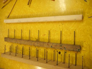
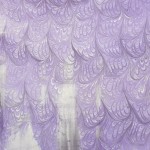
Just a few weeks ago I finally decided to buy a double rake or marbling comb so I could create a proper bouquet pattern.  Last week I carved out some time to set up the trays and try it out. Here’s what it looks like:

Regular comb on top, single rake, and double rake on the bottom

Regular comb on top, single rake, and double rake on the bottom

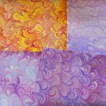
First I’ll show you the results of my play and then talk about it.

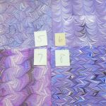
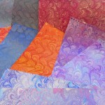
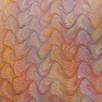
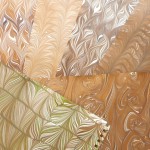
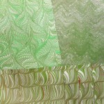
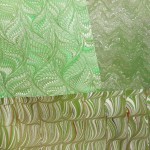
I had fun playing with the bouquet pattern in various sizes but I was limited in what I could do by the size of the comb in my tray.  There wasn’t much leeway for the comb to go back and forth across the tray as it would hit the sides pretty quickly.  I just now realized I should have tried it the other direction in the tray.  Maybe next time!  I like the results on a fine-combed nonpareil pattern, but not over a wider nonpareil, like the red and yellow piece in the middle above.  The spikes of the ” wrong way” bouquet (raked from the bottom up instead of the top down) are interesting, but not spectacular.  I tried “tying” the bouquet by running a wide rake horizontally across the pattern.  I liked the contrast of a straight line against the multiple curves of the bouquet, but it only worked with some of the color combinations.  I’ll definitely have to play a bit more.  Over all, I don’t think it’s going to become a favorite pattern. I like the way it looks, but it’s rather boring to make, a little like the nonpareil.  Except with the nonpareil there’s always the challenge of getting it perfect because any minor flaw, like a caught hair or paint fleck, really stands out.  The nonpareil can also go in so many different directions: It’s just the beginning point of so many patterns.  I thought when I started this session, I would only do bouquet patterns, but as you can see from the photos, other patterns kept creeping in.  Certain color combinations just demanded a different treatment!

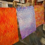
Had an interesting thing happen near the end of the session.  I was using the eyedropper to apply the paint and one of the colors suddenly went spiky on me.  This usually means something is contaminated. I usually find contamination in the carrageenan and it is normally confined to one area of the tray, but this was definitely the dark blue paint. I think it was Prussian Blue.  Instead of stopping and trashing that tray, I kept on going.  The next colors dropped in perfect circles.  I wish I’d taken a picture – perfect circles except for the dark blue spikes.  As soon as I started working with the stylus, the contamination spread and all the colors went crazy.  I played with it and printed it anyway. I skimmed the carrageenan well and produced a perfect nonpareil. The next tray after that was rubbish!  You can see the sequence of papers on the line from right to left.  I was working with smaller paper so there were two sheets laid down per tray.

Something like this always tells me it’s time to stop.  The only solution to bad contamination is to throw out the size or the paint and start again. Neither can last forever!

8 Comments

Filed under Marbled Paper

Animals Always at the St. Louis Zoo

Two weeks ago I spent a few days with some friends in St. Louis.  I liked the city a lot.  One of the highlights of the trip was the spectacular “gates” to the  zoo by sculptor Albert Paley.  Last year I had seen the scale models while they were on display at the Corcoran in Washington, DC.

Here are my photos:

Back to marbling and books next week!

Leave a Comment

Filed under Life, Other crafts

Minimalist Marbling

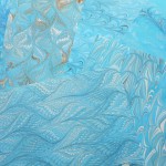
When I marble I usually have a dozen or more colors going by the third day.  I love color and I just keep adding another shade of blue or an accent of yellow.  For my last marbling session, I decided to try something completely different.  I had done some monochrome marbling before, but I had used four or five different variations – cobalt blue, Prussian blue, cyan, ultramarine blue etc. This time I used just one color plus black and white, or in a few cases, brown and white. I cheated a bit with the blue and used Cerulean blue, deep and Cerulean blue, chrome, but otherwise there was just one color.

It’s easy to get lots of shades in marbling because the paint spreads across the surface of the carrageenan and the more it spreads, the lighter it is.  As more and more paint is dropped, it spreads less and less. The first paint dropped gets compressed and so gets darker.

Some pictures of my fun time:

Cleaning up is much easier when I only use three colors!

Leave a Comment

Filed under Marbled Paper

Paper, leather, wood and metal

These books have it all!

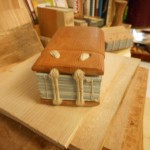
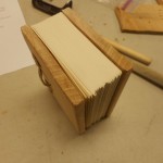
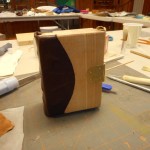
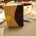
Just finished a great week at the John C. Campbell Folk School creating a book sewn over double cords, laced onto wooden boards with a metal clasp.  It was very intensive work as we used only hand tools and I’m not very skilled in either woodwork or metal crafting. Our instructor, Jim Croft, and his assistant, Brien Beidler, guided the class with great skill and wonderful patience.

As usual, I forgot to take my camera the first day and didn’t completely document some of the processes. I hope there are enough pictures that you can follow along on the path from raw materials to finished book.  The first day was spent folding, sewing, and finishing the textblock; choosing wood for the boards and designing the book.  My textblock had very little swell, so I decided to use a Romanesque/Carolingian structure which has a flat spine rather than the Gothic style (round spine) used by most of the rest of the class. Since this was a structure I had never made before, I was glad it turned out that way.

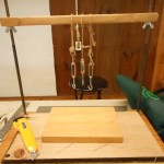
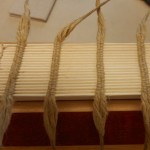
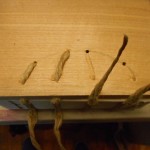
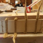
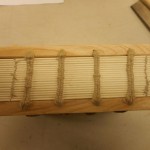
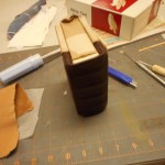
The textblock is Strathmore drawing paper which was sewn over double cords with a hand-spun linen thread. The ends of the cords were then thinned, coated with wheat paste and twisted together into points.  This made it easy to lace and unlace the boards from the cords multiple times during the construction of the book.
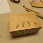
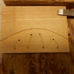
Unfortunately, I don’t have any pictures of either shaping the boards or drilling holes, but you can see the results.  With a Romanesque binding the cords are laced directly into the spine edge of the boards. The hole is drilled at an angle so the cord exits on top of the board. A second hole is drilled through the board and the cord is laced down to end on the inside of the cover. The cords are not pasted in place until the book is almost finished.

Once I knew that the cords and the boards fit, I pasted out the spine and ploughed the head and tail edges of the textblock. The boards were then adjusted to the new size of the text.  Romanesque bindings tend to have little or no square or overhang.  I didn’t plough the fore edge, but left that with an uneven, hand-torn edge.

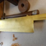
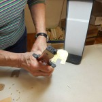
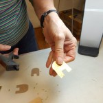
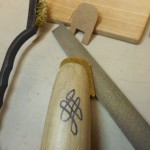
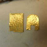
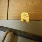
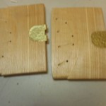
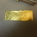
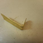
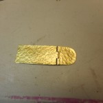
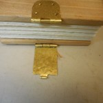
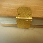
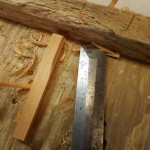
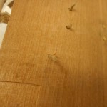
Next step was to move onto the metalwork phase, designing and making the fastening. Mine is full metal which is made in three pieces, the hinge and the catch, which are attached to the boards and the hasp, which closes the book. I started out drawing a paperboard pattern and scratching the pattern into a sheet of brass.  I cut the pattern area off the sheet and textured it with a simple dimpling by hitting it with various sized ball peen hammers. The patterns for the hinge and catch were cut and trimmed and the edges smoothed. An area of the top and bottom boards was chiseled out just enough so that the brass and the board were level. I made pins for both pieces and rolled the brass tabs around them.  That was the most difficult operation for me and I confess I had a lot of help to get it just right. Fitting the brass onto the boards involved a lot of filing, chiseling and frustration. Not much tolerance or leeway in any direction. I’ve forgotten the exact order, but the hinge and catch were fastened to the boards with rivets made from escutcheon pins and the hasp was added.  After all the fiddling, I was very pleased when everything came together and the book actually closed properly and the latch worked! Because my book was short, I had only one clasp, but most people in the class had taller books and used two clasps.

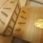
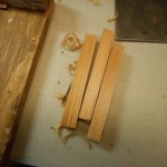
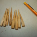
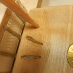
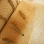
After the clasp was fitted and riveted, the boards were laced on for the final time. I pasted the cords into the grooves and then pegged the cords.  Making the pegs took longer than inserting them.  I am so not a whittler! The pegs are forced into the holes with the cords, pasted and trimmed. My pegs should have been a little thinner in the middle so they would have gone farther into the holes.

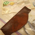
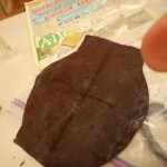
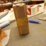
The last step is putting on the leather spine.  The leather is carefully trimmed to shape and size.  For my book, it was curved to fit the pattern on the boards and had a wide, straight-sided tab that would fold over the head and tail of the spine.  Unfortunately, I took very few pictures of the leather work. The leather is first pared, head and tail so that it will fold easily. The curved edge should fit exactly into the carved groove. After pasting it out and letting the moisture penetrate the piece, I put the leather on the book, tugging  and stretching it into place. Pasted leather is very easy to work with as it can be positioned and re-positioned many times until it is just right.  It does stretch when damp, so I had to trim it a bit. That’s the tricky part and I did get a little too much off one edge.  Before putting the leather on, I wrapped the textblock in craft paper to protect it as you can see in the photos.

Quick look at the other books made this week.

These books take a lot of time and skill to make, so I’m not sure if I’ll ever make another one, but some of what I learned will be very useful in the future.

Leave a Comment

Filed under bookbinding

Designing Boxes

I haven’t blogged in over a month, so it’s about time.  This winter has been unusual in many ways – first, all the snow!  Yes, I’m in an area that gets a lot of snow normally, but this winter has been especially persistent with neither the cold nor the snow ever letting up.  It’s almost April and I still have half my yard covered with snow.  It’s not from a sudden snow, but has been there since January. There’s still a high berm of snow around the driveway from plowing and two foot drifts in places out back.  One hopeful sign is that I’ve seen some snowdrops poking through.  They are not blooming yet, but soon.  Of course they usually bloom in February. Enough about the weather.

I occasionally have people ask if I can make them a special book or marble paper in specific colors.  I take these requests with mixed emotions. It’s fun having the challenge of working to someone else’s vision, but there’s the stress of knowing it could be an epic fail, like the carrageenan disaster I had. In February, I had four special requests and two of them involved making preservation boxes. To have them all come at once was unusual and messed up my hibernation plans. Everything was finished on time, but it took some juggling.

First request was for a wedding guest book with an engraved plate on the cover and endpapers to match the wedding colors.  We added a preservation box for the book and then complicated the box by adding a drawer to keep the printed ephemera from the wedding. Here’s a brief look at the process.

The drawer had to be larger than the book due to the size of the invitation, so I used the extra space on top to provide a place for a pen. All of the measurements have to be exact so that the contents are protected and won’t move around as the box is handled. I cut the binder’s board first, but find I often have to make slight adjustments as I’m working. Since the tolerances are small, I always am amazed that everything fits perfectly at the end.

The second request was for a preservation box to act as a portfolio for a student’s artwork.  This was a challenge as the colors and feel of the box had to complement work that I hadn’t seen and fit smoothly into someone else’s artistic vision. Plus there was time pressure.

We went through many different designs and finally settled on the combination of a black outside, gray sides, black and white paste paper interior and lined with a black and white photo.

The easiest special I did was from a customer who had bought several of my jotters in the past.  She wanted the same thing in a larger size to use in a sketching class.  I thought it was a fun idea and made some extras for sale on Etsy and at the Arts Center of Yates County.

The sketchers only have ten pages so they are perfect for day trips or to keep in a car or purse.  They are easier to organize than loose sheets of paper and keep sketches done at the same time together. I’ve used a nice drawing weight paper for the pages, so I hope people like them.

Leave a Comment

Filed under bookbinding, Boxes and Towers