Tag Archives: design

Books, Metal and Magic

It has taken me a long time to get around to this blog about my last week at the Campbell Folk School.  I’m not sure why – the press of catching up, my tiredness from the week or just the difficulty of encapsulating seven very busy and eventful days.

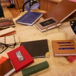
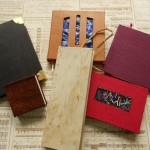
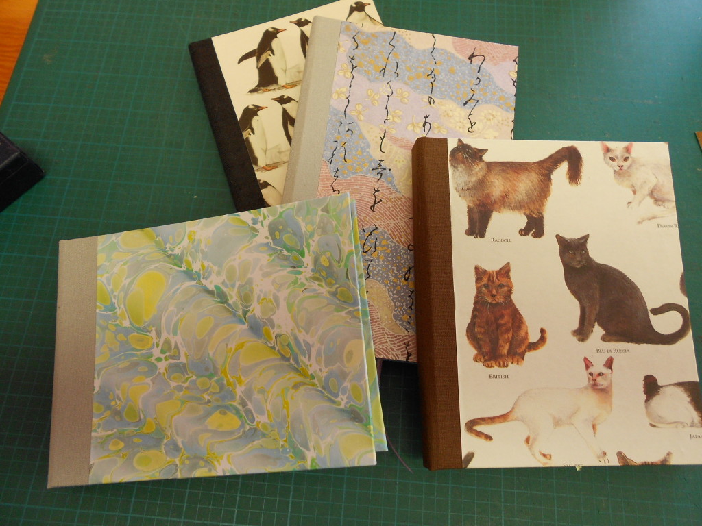
I think I’ll start backwards and show the books I finished during the week first and go into detail later.

As you can see from the outside of these books, I was playing with lots of different ideas.  What you can’t see, is that the  internal structures on these are quite different.  Unfortunately, I couldn’t find my camera for the first few days, so I have no pictures of some of the books in progress.  I’m hoping some of my classmates will share a few of their pictures.  There were only four students in the class and we were all working on very different projects, but there were some commonalities.

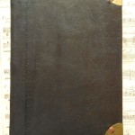
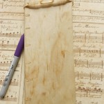
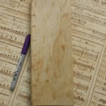
The first book I made was the 12th century account book.  I love the shape and size of the book. It’s only 3 1/2″ wide by 10″ tall.  This type of book was used for accounts and also for reading aloud. Since most of the population was illiterate, recitation and reading aloud were very important social and cultural activities.  I can imagine Chaucer holding a book like this and reading his poetry in the English Court.

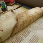
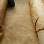
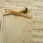
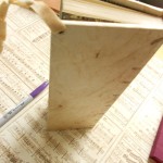
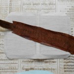
The instructor, Gian Frontini, had made a book like this from vellum. I had found some old rolls of rawhide in my basement and had brought them with me on the chance I could find something to do with them.  The match was perfect! My rawhide had been cured and scraped rather crudely which left some interesting texture and markings on the book.  I used a slightly rough Fabriano paper for the textblock. It was sewn over narrow strips of the cover rawhide which were later laced into the boards.  You can see the lacing in the photos. I made the headbands with embroidery floss, sewing them into the textblock. The book was then finished off anachronistically with some of my marbled paper.  Even though it is not correct for the period of the binding, I felt it was a wonderful match for the organic feel of the book.  Traditionally, all the edges of the book would have been painted, usually red, but I decided not to.  A laced thong of rawhide was added to the back board of the book. The thong helps to keep the book closed and was also used as a “leash” for the book.  I added a small silver bauble to help in grabbing the book.

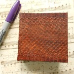
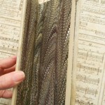
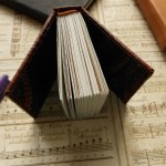
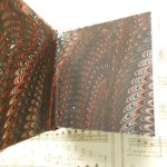
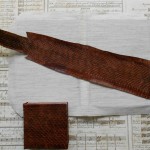
I had also found in my basement ( yes, it is a bit like Aladdin’s cave) a long, narrow roll of snakeskin.  I threw it into my box at the last minute intending to ask Gian if I could use it for something in binding. The answer was yes and I decided to make a very small book.  The snakeskin at it’s broadest was less than 4″ wide, so I settled on a book that’s only 3 inches square. Because it’s so small, I made it thick. Lots of pages with few words on each!  Like the rawhide, the snakeskin had to have Japanese paper pasted to the reverse side to give flexibility and durability to the piece. I sewed this textblock with a running Coptic stitch that was used in many Gothic books.  This stitch is not as stable as sewing over tapes, but it is more appropriate to the materials.  I cheated here on the headbands and use the paste on variety, mainly because I was afraid of running out of time. The spine was not glued down, but left as an open tube.  Again, I used my marbled paper as endpapers – a very snaky match.  I was amazed that I had brought just the right papers with me.  I only brought four or five sheets with no plan of how I would use them.  To find I had two that were such great matches was miraculous.  If you have read any of my blogs, you know how I agonize over finding just the right papers.

Next blog I’ll talk about my metal corners, enameled insets and unfinished business.


1 Comment

Filed under bookbinding, Craft design

Learning to Torch Fire Enamels

As promised, here’s a blog about the quick weekend course on using hand-held torches to fire enamels on copper. Last summer my granddaughter and I had taken a week-long workshop that covered both kiln and torch firing. I had enjoyed that and have already used a few of my pieces in my books, so I was looking forward to being able to learn some new techniques and make more pieces.  I was not disappointed.

For the basic procedures we used, see the page on Enameling.

The trickest problem with torch firing is that the copper can’t have a counter-enamel on the back.  Without a counter, the enamel is more fragile and if it is put on too heavily, will crack or warp easily. I cheated on some pieces and countered them in a kiln.
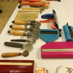
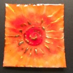
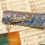
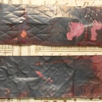
Texture was the first thing we worked on. The copper we were using as a base was rather thin and was easy to texture with crimpers, rollers and corrugaters as well as hammers. I found that putting a heavy texture into the copper made it sturdier and less likely to warp.  Because I need flat pieces for my books, I was very aware of warping.  Some examples:

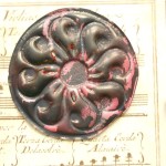
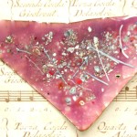
If you want the texture to show, the enamel has to be transparent, not opaque.  On the pinky-rose piece, even with transparent enamels, the underlying texture was lost because of the amount on enamel I put on the right side.  You can see the texture on the reverse. I really enjoyed playing with the various textures and could have spent a lot more time on it.  Unfortunately on the weekend courses you really have only one day of work.  The entire class spent Saturday from 9:00am to 9:00pm torching in spite of cold, wind and dark.  We used the torches outside, so light was a problem.  Unfortunately, I don’t have a picture of the torch table, but there were 6 or 8 torches set up around a table outside.  After putting the enamel on a piece, it had to be carried outside to be fired. One advantage was that it was cold enough to cool the metal quickly afer firing.
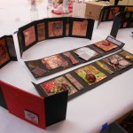
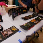
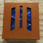
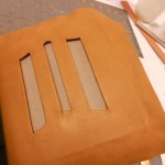
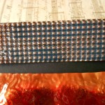
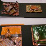
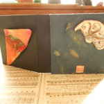
The instructor, Steve Artz, made boxes for all of the students as a way for us to display the pieces of enamelling we completed.  Here are some pictures of the boxes as well as some close-ups of my pieces.

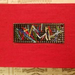
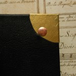
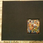
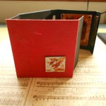
Lastly, here are two completed books. The black one has a piece I made in the summer.  The red book was made with a torch-fired piece in the Book Embellishment workshop, which will be my next blog.

Leave a Comment

Filed under Art, Craft design, Other crafts

Marbling Geography

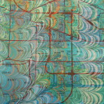
Last March, I blogged about my love of  marbling maps.  Recently I bought a large old atlas in poor shape which I am in the process of unbinding.  The pages are large, about 10″x 14″ for a single page and 20″ x 14″ for a complete double page.  The uncut page is really a bit too large for my marbling trays, so you can see some funky stuff going on at the edges where there is barely enough room to lay the paper down.  Edges can always be trimmed!

Marbling these pages was great fun as well as a challenge.  The colors printed on a map usually give very interesting and sometimes surprising results. This page is a good example of the huge difference color makes.  These maps are on one piece of paper and marbled as one piece.  The right side is a map of the world’s vegetation, colored in browns and greens with the oceans left white.  The map on the left is Great Britain and Ireland with the land areas colored by political subdivisions and with the oceans and seas in blue.

If I’d separated the pages, it would be hard to believe that they were part of the same piece of paper. Although the marbling pattern and colors are exactly the same, the whole feeling is different.  The map of Great Britain also shows how “mistakes” can add interest to maps. The light streak going up from the bottom left is a hesitation line.  By happy accident, the crosses the compass rose and could be a soft beam of light illuminating the map.

Here are some more maps with happy and not so happy accidents!

When I started marbling this paper, I had some trouble getting a smooth “lay down” due to the paper’s size and stiffness.  Consequently, I caught a bunch of bubbles before I mastered the feel of this paper. As you can see, some of these bubbles ruin the piece, some are hard to find and some can be trimmed off.  Most of the rest of the pages were fine technically with different degrees of artistic merit!
I spent the last ten days at the John C. Campbell Folk School in North Carolina and had a great time enameling and learning about historical book structures and trying my hand at some of them.  As soon as I straighten out my photos, I hope to post a blog about my experiences.


Leave a Comment

Filed under Marbled Paper

Metallics Revisited

Last February I blogged about using metallic paints. Since then I’ve played with them a bit, but a few weeks ago I decided to do some more playing and experimenting. I’m finally getting around to writing my promised blog. This time I didn’t waste any effort on white paper and only used dark colored backgrounds.  Most of the paper had deep rich tones to set off the metallic. The only metallics I used this time were gold, copper and pearl.

Here are some of the results:

Here’s what I’ve learned.  The metallics need to be dropped near the end of the sequence to have the biggest impact. The more they are manipulated, the more they tend to fall apart, but dropping them last can lead to globs that are too large. Next-to-last seems to be a good place for them.  Some, like pearl, can be dropped earlier as it “stretches” without granulating.  Metallics show up more if dropped with colors that have a high contrast, for example dropping gold with purple, rather than yellow.

I love making marbling patterns that are very intricate and fine-lined.  This doesn’t work as well with metallics. They seem to need larger areas to turn from orange to copper or grey to silver.  I don’t particularly like a lot of shininess in my work, but I do like just a hint of something, like the hidden sparkle of a bit of mica hidden in a dull stone rather than the brilliance of a cut diamond. In the past I used Golden color called “Micaeous Iron Oxide” which does just that.

Here’s an example

Large Black

Large Black

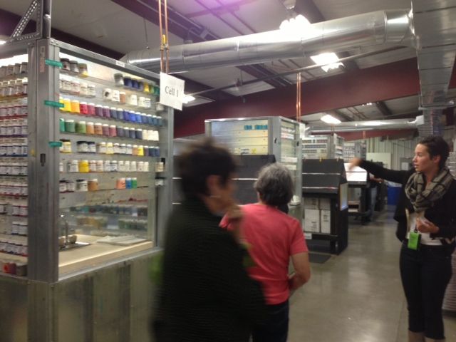
All of the paints I’ve been using recently are Golden fluid acrylics.  I really like the intensity of color they provide.  Just this past week I visited the Golden factory which is located in a very rural part of upstate New York. The trip was organized by the Penn Yan Art Guild and there were six artists who participated.  The history of Golden is very interesting, having been a family company and is now owned by its employees.  We were given a tour by Emma Golden, granddaughter of the company’s founder.

Emma Golden

This is the area where all of Golden’s color cards are hand painted. Employees walk up and down the black easels painting one color on dozens of cards at a time.

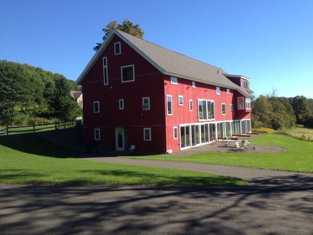
Golden barn

This is an old barn that has been remodeled into housing and studio space for the Golden Foundation‘s Artist program. It’s a beautiful location.

Leave a Comment

Filed under Art, Marbled Paper

Aqua, Teal and Turquoise

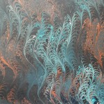
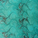
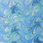
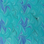
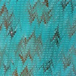
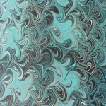
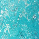
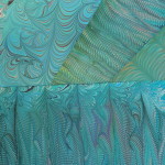
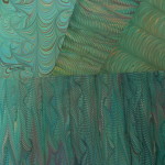
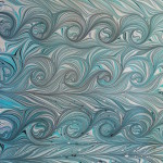
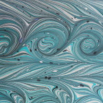
In my last marbling session, I had a lot of fun working with the turquoise family of colors.  I had four shades to play with, making a lot of interesting combinations.  Here’s a quick look at some of them.

I even added them to some of the metallic pieces.

I promise I’ll do the metallic blog soon.  I learned a lot about different effects they can produce.

Leave a Comment

Filed under Marbled Paper

What To Do When the Paper Doesn’t Fit

I recently marbled some maps that I really wanted to use as covers for my portfolios.  Unfortunately, they were just the wrong size.  Too short for the large size that fits an 8½” x 11″ writing pad and making them for a 4″ x 6″ pad would lose too much of the map.  I thought about either patching two together or framing them for the large portfolio, but just didn’t like that solution.  They would be perfect for a 7″ x 10″ pad.  Problem is, no one seems to make that size pad.  I could have them specially made but that would be expensive and replacements would be a nuisance for the customer. So I did the next best thing, used a 6″ x 9″ pad and made the holder a little bigger than it needed to be.

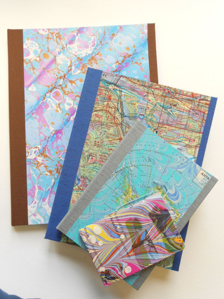
Now I have notepad covers that range from the small memo size to the full 8½” x 11″. Here are samples of the full range.

Four Sizes of Writing Pad Covers

Four Sizes of Writing Pad Covers

Here are the two new covers I just made.

The blue cover has old street maps of Washington, DC and the red cover are pages from a vintage children’s book about the seasons.  Both were hand-marbled by me.

More photos of the four sizes.

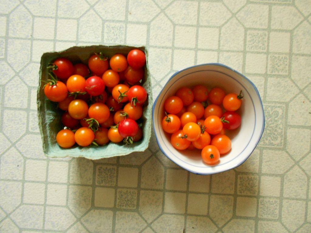
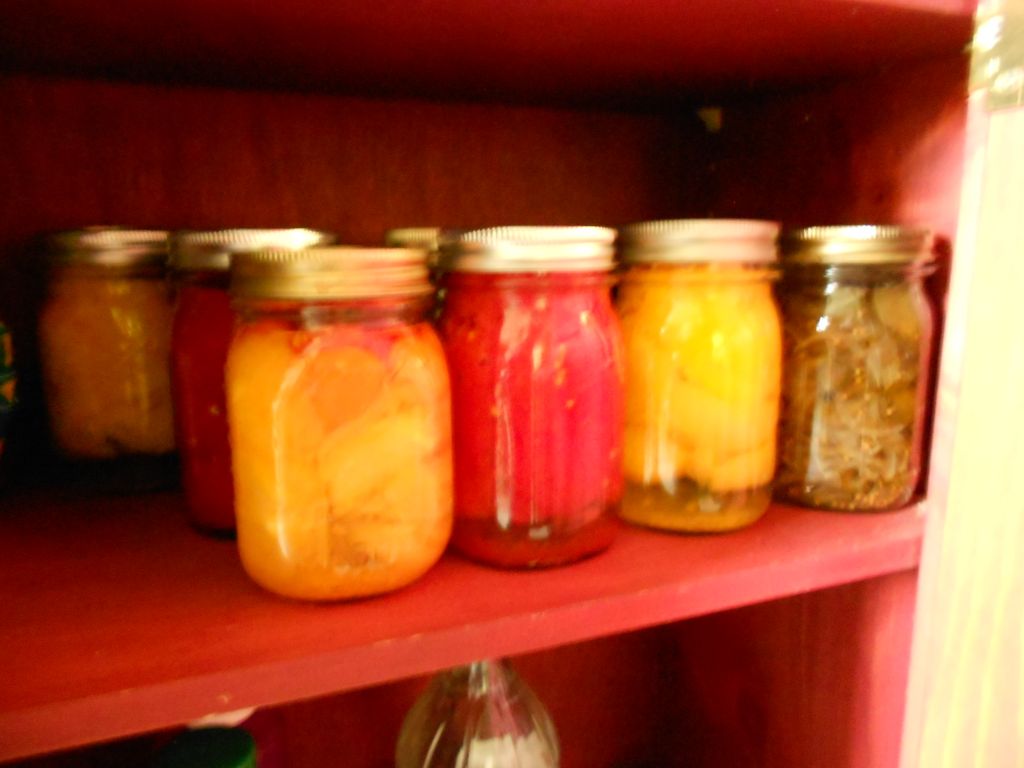
Last week I spent a lot of time marbling and I hope to get a blog up about my adventures with metallic marbling up soon.  I also canned the last of my pickles and the first of my tomatoes for this year!  The cherry tomato crop is still going strong with the return of hot weather and I hate to see them going to waste. I don’t hate it enough to try to skin them for canning though!

Cherry Tomatoes, red and gold

Cherry Tomatoes, red and gold

Tomatoes & Pickles

Tomatoes & Pickles

But most important of all, last week brought a new member of the family.

Back

She’s an eight-year old Beagle/Basset mix I adopted from a local shelter and she’s loving that I have lots of rabbits on my property.


1 Comment

Filed under Life, Notebooks

Kilns and Torches and Enameling Fun

My granddaughter and I just finished our second year attending the Inter-generational Week at the John C. Campbell Folk School.  Last year we did woodcarving and this year we did enameling.  At its simplest, enameling is the process of heating glass and copper together so that they form a bond and the glass fuses to the copper base.

In this class, we used sheet copper most of the time which could be shaped by repeated heating and cooling.  For most of my work, I stayed with flat forms because I’m hoping to be able to use these pieces in my bookbinding.  Someone said to me that I seem to like rectangles and squares!  Only because my books tend to be that shape.  Here are photos of some of the finished pieces.

We used both torches and kilns to fire the pieces.  The kiln was more predictable, but the torches were more fun!

I’ve added a lot more detail about how we worked, the materials we used and lots more pictures here.  I’m excited to start trying to use these on some books.  I have no idea if it’ll work, but it will be interesting!

On a totally different topic, I had lots of time to think as I was driving home, it took 2 1/2 days! One of the things that struck me, was the way the road has changed.  I’ve driven Route 15 through Pennsylvania on a rather regular basis since the early 1970’s. In the early days most of it was two or three-lane, but now it’s almost completely a divided, four-lane limited access highway.  Some of it still goes over the path of the old road, which may have been over game, trails, Indian paths, logging roads – I haven’t researched it.  That evolution has been very fast.  My image, though, was of archaeologists several thousand years from now, long after the automobile has gone the way of the chariot, painstakingly unearthing, studying and recreating all those multiple layers of roadway.  Even now in towns and cities, when streets are replaced 19th century bricks, logs, rails etc. are found.  Just a thought while driving!

Oh, and by the way, I have lots and lots of HUGE cucumbers.  They’ve turned slightly bitter, so I think they’ll be compost or rabbit food, but the tomatoes are just beginning, so I haven’t missed those.

1 Comment

Filed under Craft design, Other crafts

Back to Basics – Marbling and Book making

For the past few months, I’ve been consumed with the idea of making “different” books.  I’ve tried some soft covers, some Coptic bindings, some upcycling which were all fun stuff, but last week I felt the need to get back to the traditional, case-bound hard covered book. I started a batch of five and it proved to me several things.  As much fun as the other books are, I don’t feel as if they are Real books and I get more satisfaction out of making a book I know will last than the novelties.  They are fun, but transient. I can’t imagine that my hanging books or the floppy diskette books will be around in fifty years; the hard covers could be.  That said, I know I’ll still make both kinds.

These are last week’s books.

June Hard Bound

June Hard Bound

These aren’t actually finished.  They still need casing in.  The fifth book has a leather spine, so it is taking a bit longer.

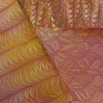
As much as I enjoyed the marbling class, I felt a bit frustrated by it.  Since I was demonstrating, teaching and helping everyone, I didn’t have time to do any real work myself.  I hadn’t expected to, but still  … When I finally finished cleaning up everything and reorganizing my basement, I wanted to spend some time doing some real marbling.  Here again, I have been playing with a lot of different techniques (over-marbling, masking, figures) and wanted to go back to form and color.  One of the best things about marbling is that it’s so easy even a child can do it, yet it can take years to truly master different techniques.  Maybe like playing a drum!

Again, my last few marbling sessions have been caught up in special effects.  This time I was determined to slow down and enjoy exploring color and pattern.  Turned out to be a great idea.  I’ve had a marvelous week, in spite of the usual frustrations! Tuesday and Wednesday were unusually productive and so far I’ve produced over 50 pieces.  And that’s not counting the “tray fillers”.

Again, my basement becomes my Studio and some of the papers.

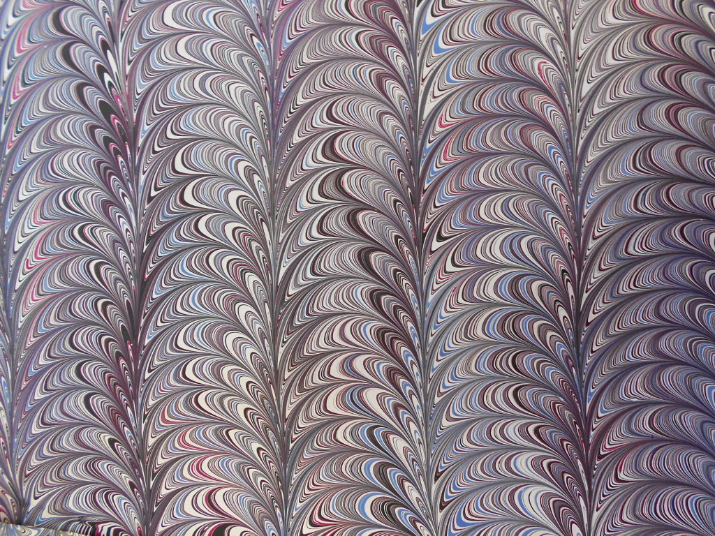
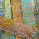
Lots of things going on here!  As you may be able to see, I tried to stay with a single color palette for several sheets, making small change in color and design from sheet to sheet.  It’s hard to tell from the pile, but there are probably five or six sheets of each colorway.  You can see it most clearly in the black set.  I used only black, grey, white and one accent color for each sheet.  I used the same pattern, but changed the size of the comb and the rake.  The feel of the piece becomes quite different.  The Dark blue set was on a very stiff card stock and is generally a mess.  I haven’t used anything that heavy in a while and it takes getting used to!  Since it doesn’t bend easily, it is very easy to catch air bubbles and the technique used to lay the paper on the marbling tray is a bit different.  As you can see from the closeup, I was also having some problems with contamination in the tray about that time.  With marbling, there is always something to keep me on my toes.

I love doing maps and did a batch from atlases, road maps and street directories.  I also cut a Pennsylvania highway map into  strips that would fill the tray when I was doing smaller pieces. Not sure what I’ll do with them, but they’ll come in useful some day.  If not, I know a number of collage artists who will use them.  My favorite map was the one of Turkey done in browns and yellows.  It reminds me so much of the time I spent there many eons ago, travelling across from Afghanistan.  Couldn’t do that now.

Marbling is always interesting and always a bit of a surprise.  The colors are never quite what I expect, sometimes better, sometimes not.  And there’s always that dreaded air bubble just waiting to spoil the perfect piece!

Now that summer is really here, my marbling trays will probably remained packed up.  I just have to start using up or selling all this wonderful paper so I can make more!

1 Comment

Filed under bookbinding, Craft design, Marbled Paper

Books on a Theme: Face to Face

As soon as I finished the Marbling Class, I changed my focus to the next exhibit being hung by my local gallery. The theme is Face to Face and the drop-off day for artwork was this past Monday.  Not much time!  I already had a few of the soft-cover books I had made in North Carolina, but I didn’t really have much that spoke to the theme. I had been thinking about a Dos à Dos book.  Back to back is almost like face to face.  I also was eager to play with some of my “scraps” to upcycle.

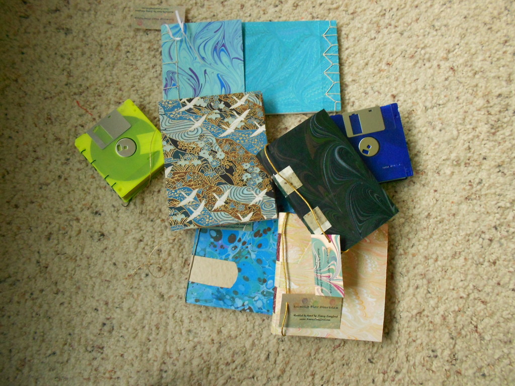
Here is what I came up with and was able to finish last week.

June "Face to Face" books

June “Face to Face” books

The upcycled (fancy way of saying recycled) diskettes were great fun and I had the perfect paper for the yellow one. They are bound with a simple Coptic stitch.

The Dos à dos took a little more thought. I couldn’t decide quit how to cover the middle board.  I could cover it completely with one paper and use the same paper for the front and back covers, but that seemed boring.  I decided I definitely wanted a different, but coordinated, front and back. As I was going through my paper, I found I had three different versions of crane patterns in the Chiyogami.  Problem solved!  I used the blue crane for the front, the white crane for the back and the tan crane for the center board.  Again, I used a simple Coptic stitch binding for the spines.  I was even able to play with the color of the waxed thread: blue for the front and red for the back.  I enjoyed making this and can see myself exploring this format again.

I’m sorry that I didn’t take a better picture of the center board.  Maybe I can drop by the Gallery and take one.

After finishing the crane book, I kept thinking about how to make two books facing each other.  I had seen something like that done in a stab stitch binding, but couldn’t locate it. So I started playing and came up with this.

I started with a piece of mat board I had marbled in blues. I then added two different sized textblocks, one to each end of the board with simple stab stitch patterns.  The covers of the textblocks overlap, but the pages don’t.  Since you usually write with the spine on the left, I made the two books upside down to each other.

As a last hurrah, I took the case for a single floppy disk and put two tiny stab stitched books in it with a tiny pencil. Unfortunately, I forgot to take any pictures, but if I do get down to the gallery, I’ll take some and post them!

Added on 6/15:  Some poor quality pictures of “Just in Case.”

All-in-all, a very busy and productive and FUN week!

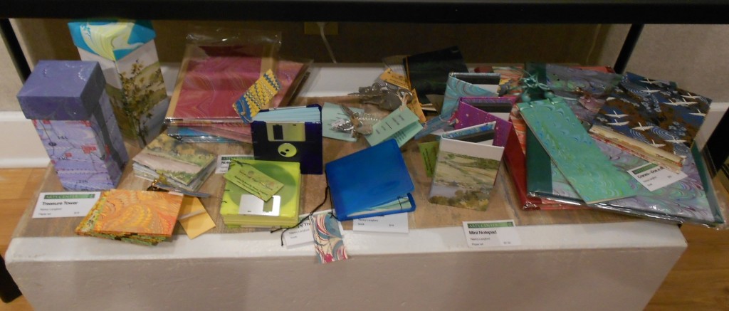
A last picture of my items on display at the gallery; just a bit crowded.

DSCN3749

Leave a Comment

Filed under bookbinding

New Hanging Books

This is just a quick post to show off my latest batch of hanging books.  I made some with “soft” covers – really very stiff or heavy card stock- and some with Davey board covered with my marbled paper.  The board covers are hinged or articulated in order for them to open properly. I’ve had a lot of fun searching through boxes of old beads to find ones to use on these books.  It feels good to actually use some of the stuff in the basement instead of just tossing it.  Most of the cords and raffia are also from the stash.

Previous versions of hanging books in a blog posted a year ago.

I also tried out a new soft cover binding, but ruined it in the finishing process.  If I am brave enough, I may post some pictures!

Etsy

1 Comment

Filed under bookbinding, Marbled Paper