Tag Archives: design

Cold Amid the Soft Covers

I promised a blog about my soft-cover books, but first a rant.  Why it is so freaking cold in mid-April?  Wet, cold, gloomy and just the pits!  I suppose I should be happy there are no snow storms or tornadoes, but it’s all about me and I’m COLD!  I have heard there is a magic line about 100 miles south of me where it is warm and spring-like and cherry blossoms are blooming, but not here, not now and that’s not good.  Enough of this already.

On to the books.  I will confess, I have a conflicted relationship with soft cover books.  They can be very diverse, imaginative and fun to make, but they aren’t “real” books.  In my more traditional moments, I equate them with paperbacks and “crappy crafts” as being very disposable, not something one keeps. On the other hand, they are fun and usually easy to make.

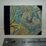
When I was on my recent vacation, I bought the materials to make a few when I tried of the ladder games. Naturally, I choose a type of softcover book that is rather traditional in shape. It has the added advantage of having a relatively stable spine.  Many soft cover books have little stability and the spines can twist and wiggle. This book has a nice long-stitch spine and tabs that wrap both front and back which creates a double thickness on the spine.  Once I finished my  first prototype, I began to see some great possibilities for using some of my heavier marbled paper.

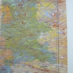
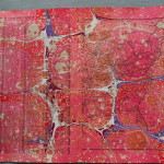
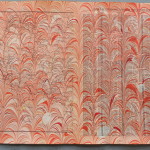
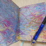
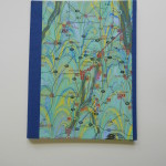
Here’s a look at the first one I made (the second isn’t finished yet) and four that I made with my marbled paper once I came home.

The front and back covers are cut at the same time with the tabs interlaced. Works great if you are using the same paper for both, but since I was using my marbled paper for one side, it left an extra set.  There isn’t an individual picture, but in the group you can see that I made a second book from the green textured paper, but with a black marbled piece for the cover.

As usual, some of these books will be available on Etsy.


3 Comments

Filed under bookbinding, Life, Marbled Paper

Maps of the Mind, Marbled, of course

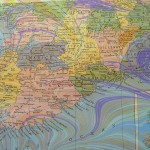
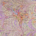
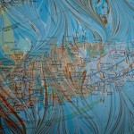
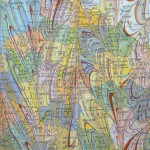
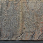
Maps are some of my favorite recycled papers to marble.  I try to use colors that complement the areas of the map – browns and rust for desserts, blues and greens over the oceans – as well as harmonize with any printed colors.  As with much in marbling, you can plan a lot, but the paints seem to have a will of their own in the end and that’s the element I find so fascinating.  The little drop of white that centers itself right over a town or the purple swirl that almost follows a coastline  or the yellow streak of marbling that happens to disappear on top of a printed red and magically appear again to lead to a river or mountain is always a surprise.

Here are a few maps I’ve marbled in the past.

In my last marbling session I did a bunch of pages from an atlas.  Because of the way books are made, when disbound the pages are not consecutive, so I had gazetteer pages facing map pages.  I had originally planned to use both pages for ladders,  but I like the maps so much that I don’t want to cut them up.  Here are some of the pages.

I’ve used my marbled maps in numerous projects: books, towers, portfolios, almost everything I make, I’ve tried it with maps.

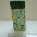
The map covered towers have been very popular, especially when I use local maps.  Eventually I will map some map ladders, but right now I’m “laddered-out” as you will see in my next blog!

1 Comment

Filed under Craft design, Marbled Paper

Shimmer & Shine

One aspect of marbling that haven’t explored much is the use of metallic paints.  I had tried some in the past with rather mediocre success and just hadn’t worked with them again.  During the class at the Campbell Folk School this fall,  I had some very successful pieces with metallic paints.

These two pieces show the use of metallics. In my last marbling session, I decided to explore their use a bit more, trying to match metallics with colors and just seeing how they reacted with other colors.

One of the first things I verified was that metallics just don’t show up well on white paper.  They tend to just look like a flat brown, orange or grey.  The colors I was playing with were gold, copper, bronze and silver.  Here are three white cards that had gold and copper on them.

As you can see, it’s hard to tell where the metallic is.  In contrast to this, here are some of the pieces I made with metallic paints using colored card stock.

The papers used for these pieces were black, royal blue, red, and purple. The gold and coppers are much clearer.  The amount of shininess depends entirely upon the amount of paint dropped.  On some of these there is way too much.  One problem that arises with metallic paint is that it granulates very quickly and has to be constantly stirred – without making bubbles!  This paint had the added problem that it was old and even more prone to coming out of suspension.  Fine for experimenting, but not the best.  That is why there are so many little “bits” of paint in the designs. These are especially noticeable on the fine lines of the get-gels.  On the purple stone piece, I decided to join rather than fight, so I left it at the stone stage without trying to do any drawing out.

I think I’ll continue working with metallic paint, in moderation.  I like the clear crisp colors a bit better, but it does have a place in my marbling palette.

1 Comment

Filed under Craft design, Marbled Paper

More Ladders

I was so pleased that I finally have the ribbons straightened out that I made a bunch more of the Ladders.  I’m especially enjoying using pages from vintage books.  The way the paper is cut, I rarely have complete paragraphs or even sentences.  It is a mind stretcher to “read” some of them.  They are not really just random words, but more like dream thoughts that never get quite completed.  I’ve cut a bunch more from cookbooks, Shakespeare and even the Bible.  I’m looking forward to putting them together.

In the meantime here are the ones I’ve finished.

All of these are for sale on Etsy.  In other news, I’m still cleaning up from my last marbling session. Marbling is fun, but it does make a mess!

I’m still sorting out the papers and trying to decide which papers to use and which to sell. That’s always a fun enterprise.  More on those papers later … I hope!

1 Comment

Filed under Craft design, Marbled Paper

Rainbow Update

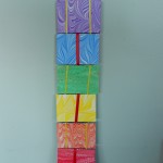
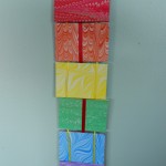
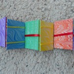
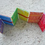
Just a quickie to show you what I’ve done with some of my “rainbow” paper. Yes, I know that the rainbow really has seven colors, not six.  These are actually the primary and secondary colors on a color wheel, but rainbow sounds better.  Anyway, here is my newest plaything.

I’ve already cut the paper for a second one and have been marbling a lot of interesting vintage paper to make more.  Now that I’ve finally gotten the ribbons working, it’s fun.  I admit, I still have the 28 step instructions right in front of me every time!


Leave a Comment

Filed under Craft design, Marbled Paper

Monochromatic Rainbow

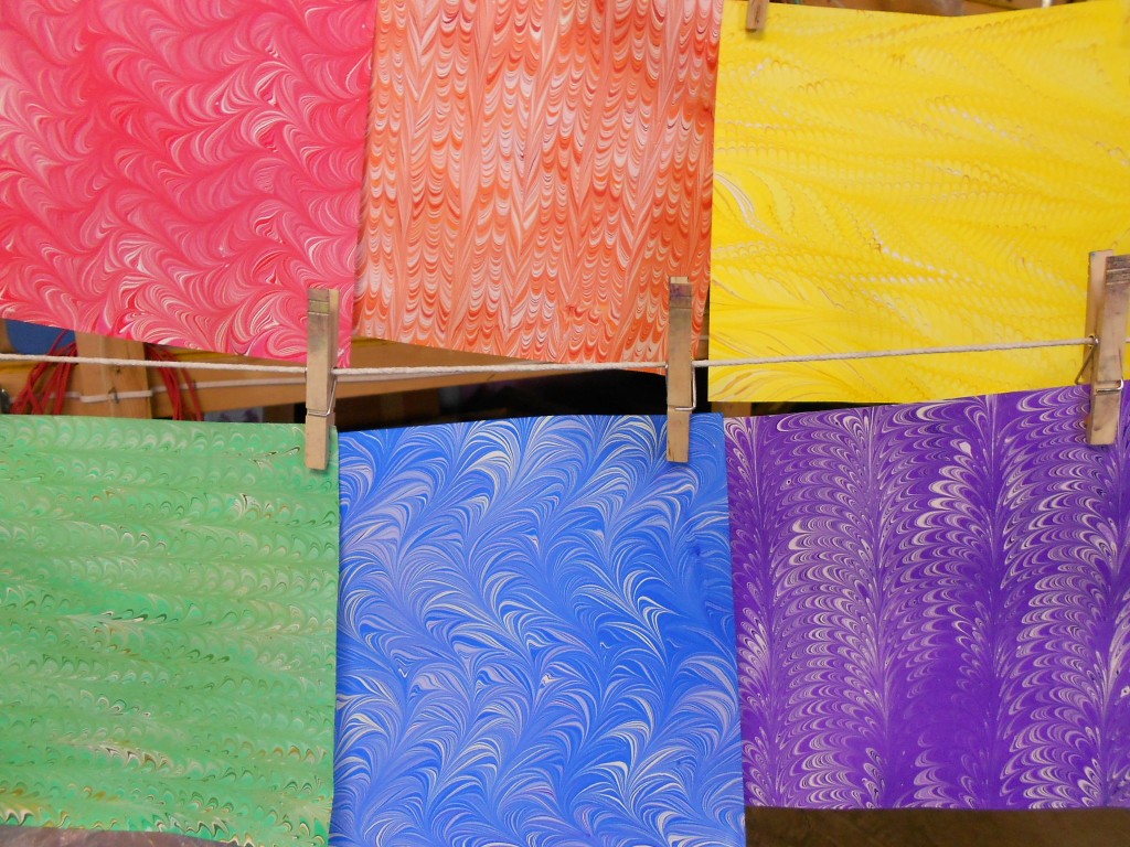
I suppose that’s actually an oxymoron, but it describes the marbling I did this weekend!  I was so impressed by the “shades of grey” piece I did at the beginning of January, that I decided to expand the repertoire. Now I have monochromatic pieces of all the primary and secondary colors; red, orange, yellow, green, blue and purple.  All I need now is to figure out how to use them!

Here’s one of each on the line.

Rainbow3

and a quick gallery of them all:

There are four sheets of each color except the blue.  I really like the fresh, clean look of these.  I plan to do more this week, but I also have other ideas. Today I also did some marbling using masks to cover portions of the paper so they don’t have paint.  They can either be left plain or overmarbled.  I hope to have those results for you by the end of this week.

Sometimes there are too many ideas for the time I have.  Decisions, decisions, decisions. As much as I love having piles of paper around, it does help if I can actually sell some or make something from them to sell.  At least it gives me money to buy more supplies.


1 Comment

Filed under Craft design, Marbled Paper

It’s Material

The local Arts Center where I display my books and paper, changes their exhibit about ten times a year. Each exhibit has a theme and artists are invited to submit works centered around the theme. I received the listing for 2013 a few weeks ago and the February exhibit’s theme is “It’s Material”.  I was puzzled how I could make my books reflect the theme.  I was thinking material goods, money, bling, flash – you get the picture.  I finally hit on something and then, after I had started the books, discovered they were featuring textile artists!  Oh, well.  I’m still going with my idea although I have covered books with fabric in the past and may take in those also.

So what was my idea?  Just these.

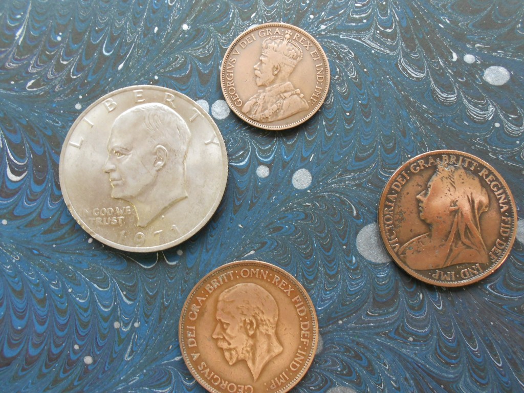
Material coins

I’m a collector (that’s a polite word for pack rat) and when I came across these, they clicked with the February theme.

I generally don’t care for embellishments on book covers.  The cute seashells, the fancy ribbons, or little doodads leave me cold.  Besides, it makes it almost impossible to put the book on a shelf without damaging it or its neighbors. My idea with the coins was to inset them into the cover so they would be flush with the boards. To accomplish this, I excavated circles on the covers about the thickness of the coin.

The Eisenhower dollar was about the same thickness as the Davey board, so I backed those covers with a piece of mat board.  The edge-on shot shows the plied covers.

I then added the spines and marbled paper covers in the usual manner and glued the coins into the depressions.  I should have made them a bit deeper to allow for the thickness of the paper and adhesive, but I’m very pleased with the result.  I adhered the coins with PVA, so I don’t know if they will stay.  So far they seem to be holding well, although I’m sure they could be pried off. 


These books were great fun and I’m happy with the results!  What more could I want?

Maybe to get to overmarbling tomorrow?  Stay tuned, it might just happen!

1 Comment

Filed under bookbinding, Craft design

Quick “show and tell” of my last overmarbling

Why is it that when you really want spectacular results the souffle falls? At least it seems that way.  I was hoping that the few overmarbles I did in the last batch would be good demonstrations of how the technique can work.  Instead they are just some more examples of not-quite-hits.  It happens.   Next time …

Anyway I did promise to show you and here are the results, side by side.

Example 1:
The original paper is on the right, overmarbled on the left.

No alumNo alum - over

The original sheet either was missed in the alum process or was flipped and I tried to print on the wrong side.  Most of the pigment and pattern washed off in the water bath.  You can see a few traces of a nonpareil pattern on the left edge.  The remaining pigments left a pale wash over the paper.  The overmarbling used similar color in a wide, looping pattern that gained some resonance from the under pattern, but nothing outstanding. It’s a pleasant piece, but not what I hoped for.

Example 2:

Washed outWashed - over

This original piece was in pale, almost washed-out greens. This photo makes the piece look worse than it was.  It was nice, just rather wishy-washy.  I thought it might be a good candidate. I over marbled it with yellows, burnt sienna and oranges. Unfotunately, the burnt sienna granulated a bit and didn’t give the strong lines I was expecting. The undercoat gives interesting shadows and reflections, but not the “wow” factor.

Example 3:

PurplePurple - over

This piece was quite successful in bringing a rather namby-pamby piece back to life.  I’d had a problem with the yellow in the first piece pushing all the other colors and then disappearing when printed. For the over coat, I used the same colors in the same stone pattern without the yellow and obtained a very nice colorful piece.  This one is the most interesting to try and trace the under and over patterns. If you focus on the black, almost triangular shape a little to the left and above center in the first piece, you can see the same shape in the middle of a large purple stone in the second.  From there, you can trace many of the black veins and colored stones.

Example 4:

Green Green - over

This was my most successful piece of these four.  At least I think so!  The original piece was nice with a little bit of a ripple going on, but it had some flaws that would have made it hard to use.  For the overmarble, I used similar colors, but made them more intense.  I tired to echo the under pattern, without the ripple.  The ripple shows through and gives a very subtle motion to the piece.  The flaws tend to blend into the new patterns and make the piece very usable,

I’m hoping to start another marbling session this weekend and I’m excited to have just received a shipment of lots of new colors in my new paint.

In the meantime, I’m frustrating myself making some more Jacob’s ladders.  Preparing the blocks is a piece of cake.  Threading the ribbons is a whole different matter!  There always seems to be one that is not right – usually the broken rung is in the middle.  Will post more pictures when (and if) I get them right.  Doesn’t matter, I’m having fun.

Later posts on overmarbling:  Playing  Addendum

2 Comments

Filed under Craft design, Marbled Paper

Exploring Overmarbling, when and if …

Busy, busy, busy.  I’ve been home for almost a month and still haven’t been able to do any marbling.  Very frustrating as there were so many techniques that we had a taste of in my marbling class and I really want to spend some time with them.  Now, it looks like I’ll have to wait until the new year.

As soon as I arrived home, I had four special order books to finish.  All of them were larger (9″x12″ and 8.5″x11″) than I usually make.  Although the larger size is more impressive, I think I’ll stick to my smaller, pocket-sized fare.  I just enjoy them more.  One of the books was a sewn perfect/adhesive binding.  I hate making those, but there was no choice in this case as the pages were photographs.  I did this for a local photographer and he was pleased.  Unfortunately, I didn’t think to take any pictures of  the book!  He seems to think other photographers would be interested, but I’m not sure I want to do more.  I’d rather just do a clam-shell box!

Overmarbling

Overmarbling is the technique of taking a dried piece of marbled paper and after applying alum, marbling it for a second time.  When I first learned to marble, I had done some with poor results and felt it was used mainly to try to save a piece that wasn’t very good anyway. Here’s a poor example of overmarbling:   as you can see, it’s just a simple get-gel over very large “eggs” or boulders.

This time I learned that, with careful choices of colors and patterns, you can get really spectacular results.  The second marbling can add depth, movement and definition to a piece.

Here are three pieces (above) that worked well.  Click on the thumbnail to enlarge and see if you can trace which colors and patterns are on the top layer and which are on the bottom.

Below are some combinations that didn’t work so well!

Although, even with these, there are portions that could be used in collage work or in my boxes or notepads.  It’s mainly the large sheet that just doesn’t work.

This is by far my favorite piece of overmarbling.  The colors are just right and the patterns compliment and enrich each other.

and some close-ups:

Another technique that can be used to great advantage with overmarbling is masking, but that will wait for another blog.

Three more posts on overmarbling: More  Playing  Addendum


1 Comment

Filed under Craft design, Marbled Paper

Around the World in Marbling

It’s been a while since I’ve updated this blog.  My only excuse it that I’ve been busy, busy, busy. I was away from home for a month, enjoying Washington DC, North Carolina and Texas. They all deserve separate blogs, but I probably won’t do that!  I’m going to start with the great time I had back at the John C. Campbell Folk School.
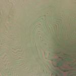
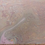
At the Folk School, I took a great marbling course with Pat Thomas.  The theme of the week was “Marbling Around the World” and we tried marbling techniques from various countries.  Japan was the first stop and I tried suminagashi marbling for the first time. It is done with Japanese ink on plain water and gives very different patterns than the usual marbling. The ink is loaded on  brushes and the tip of the bush just touches the water, leaving a bit of ink. Concentric circles are formed by repeated brush touches in the same place.  Once there is enough ink floating on the water, the surface is rippled by blowing on it or by waving a fan lightly over the surface.  There are YouTubes showing Japanese masters making all sorts of designs, even landscapes.  I made lots of circles and a few designs that began to look like something from dreams or nightmares.

As you can see, the colors are faint and look rather like topographic maps. Clicking on the thumbnails helps.  Much more practice is needed for this.


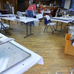
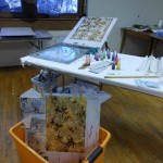
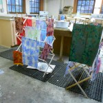
There were five people in the workshop, so there was plenty of space for everyone. Here is the room set-up showing the marbling stations and the drying racks.

Our next stop was Turkey and into the classic stone and get-gel patterns.

Then on to Spain for some Spanish ripple.

I like some of the 3-D effects this produces, but I need more practice to be able to produce nice even rolls every time. We also did the New Jersey ripple, but mine was a total mess.  I’ll try it again in my next marbling session (probably after New Years) and show you what it’s supposed to look like, with luck.

France was represented by the nonpareil and French curl patterns.


We did a lot of overmarbling, both plain and with masks, but I’m going to save that for a separate blog.

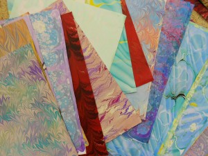
Here’s my pile of papers. Now I have to figure out what to do with all of them.  Fun times ahead!

All in all, a great time was has by everyone.


2 Comments

Filed under Marbled Paper