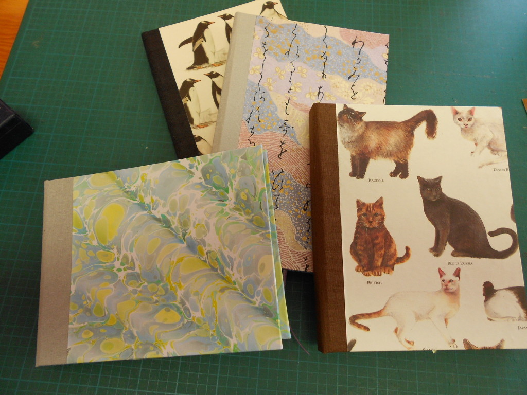
Tag Archives: papers

More on Cases

Explaining making cases seems to be taking even longer than actually making them!  We’re getting close to the end. Promise! This blog will be a quickie, just on covering the boards.  It’s one of my favorite parts as it is really the beginning of the end and I wind up with something that really looks like a book.  It also is the stage where my decisions on color, size and paper either come together or just miss.
So here are the graphics:

First the cover paper is cut to size leaving about 3/4″ turn-in on three sides. Fourth side will be flush with the spine. Before pasting out the paper, measure the paper against the spine and put a tiny pencil mark at head and tail.  These will be your guides as you place the paper down.  Using these marks as guides, place the dry paper under the board and trim the corners.  I use two pieces of scrap board as a cutting guide.  This gives a turn-in on the corner that is a bit larger than recommended, but it has saved a lot of covers for me!

With everything marked and trimmed, paste out the paper starting from the center.  Always put your adhesive on the paper and not the board. Paper stretches when it comes in contact with any moisture and you want it to stretch before it is on the board.  This way, as the paper dries, it will shrink giving a nice smooth fit.  Paper that has been pasted out will tend to curl or become all loose and floppy so the register marks become very important.  As you place the paper down, the marks will NOT be quite accurate because of the stretching. If you are worried about getting a perfect edge between the paper and spine, you can let the paper ride up over the spine by a tiny amount, not more than 1/32 inch.

When I paste out, I leave a very small dry area at the fore edge turn-in and on the spine edge of the head and tail turn-ins. This allows me to handle the paper from these very small dry areas and not get PVA all over my fingers. It also seems to give me more control over the paper. The bad part of this is that some papers will pucker around any dry area.  As with any technique, try several and use the one that works for you.  I work with many different weight papers for my covers and have found that I have to adapt my techniques to the paper.

Lay the paper down, starting at the spine edge and gently smooth it down toward the edges. Don’t rub it down hard until you are sure that it is smooth and positioned correctly. Make a fist and use the pinkie side to smooth down the paper. This is the flattest surface you can make with your hands. Bone folders are not recommended in smoothing damp paper. It’s just too easy to press too hard and tear the paper.  I do use them or the back of a fingernail on the edges on the board to get a nice crisp edge. After the front is pasted, flip the board over and turn in the head and tail and finally the fore edge margins.  You may have to add paste if it has dried or if you have used my “dry spot” method. Cover the back board in the same way and you are done!  Ideally you should have a 3/4″ turn-in all around the case.

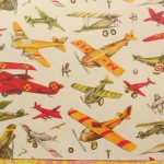
Notes on special cases:  If your cover paper has a figurative design, you’ll want to take care on the cover placement.  See the airplane design in the photos. In cutting the paper, I had to waste a bit of paper to place the red plane where I wanted it. With any designs that have a definite up and down, make sure you cut pieces that are mirror images of each other, not the same and that both are facing in the same direction when on the book.  All over designs are much easier.
Half-cloth binding: On the binding that has bookcloth on the corners, I marked the board with diagonal lines 1″ in from the top and bottom fore edges. After registering the head and tail, I folded the paper along those lines. The paper was then trimmed along the same lines and pasted down, leaving the board exposed in the corners.  The small triangles of book cloth were pasted onto the board corners, trimmed, folded under and pasted down.

In general when pasting, always put the paste on the material that will stretch the most. Everything, even board and wood will stretch when wet. With some materials it is hardly noticeable.  PVA dries faster than paste which has the advantage that it “grabs” quickly and the disadvantage that re-doing something becomes harder.  Paste is much more forgiving and a cover can be repositioned several times, but it grabs more slowly and you may have to hold something in position for a while.

Next I will put the finishing touches on the textblock and marry the case to the text.

Leave a Comment

Filed under bookbinding

Books, Step by Step

Sometimes I make books in almost a production mode, working on them every day till they are done.  Other times, I do it in fits and starts, leaving them half started for a while and coming back to them after many interruptions.  The last four books that I wrote about appear to fall into the latter class!  I did the design work, choosing papers and then put them aside.
This week, I went back to them for the next step – choosing paper for the text block and deciding on the size and shape of the book.  I didn’t do anything special with the papers this time.  I’m using my standard Strathmore and Canson drawing papers. I like the weight and feel of them.  I would love it if I could get them in colors, but the colored sheets tend to be heavier as well as much more expensive. I do use Pastel paper occasionally, but it has a definite “tooth” and is not right for some of my books.  I also like the Strathmore “Toned Tan” and “Toned Grey” for my earthier creations and have used a lot of that in the long-stitch books.
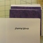
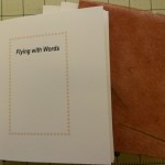
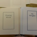
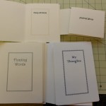
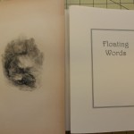
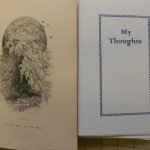
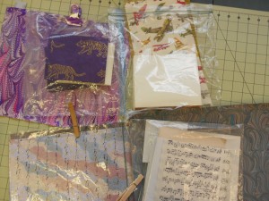
Back to the current four.  After cutting the text paper, I print a title page, verso and colophon.  Most blank books don’t have titles, but I like adding them.  I think it makes them more like real books. My titles range from the pedestrian My Journal, to the whymiscal Wish on a Fish. They tend to reflect the color, Purple Prose, or content, Purring Thoughts, of the book’s cover.  These titles were more of the pedestrian variety. Here the pages have been cut and folded and the titles printed.

The two larger books are almost the same size. The smaller one was cut to fit the tiger endpapers and the medium sized one was determined by the cover design. The pages are folded and gathered into sections or gatherings, ready to be punched and sewn.  I like to add an extra ornamental page of light weight paper around the even sections, just to add a little something special. Here are the papers I chose for the larger books.

I also added frontispieces to the two larger books.  These are illustrations that were taken from two different books from 1840-1850.  The books were badly damaged and had fallen apart, but I was able to rescue some of the engravings.  The illustrations are not copies, they are the real thing.  As you can see in the photo, they need to be trimmed down and tipped in.  I’ll do this by leaving a narrow edge that will fold around the back of the title page.  The flap will be glued in, but it will also be sewn into the first gathering, making it an integral part of the book.  Sometimes, when the paper is too brittle to fold or is smaller than the book, I just tip it in opposite the title.

My next steps will be to attach the frontispieces and sew all of the textblocks.  In the meantime, I have learned to put all parts of each book into a separate plastic bag!  Before I did this consistently, I would switch papers mid-stream and discover I had to cut paper all over again to match the new configurations!Bagged2

The reason I didn’t move on to sewing the textblocks was that I was sidetracked by note cards, which will be my next blog.  I hope to get to it soon.

I have written at length about all the processes in making a book on other pages on this site, starting here.


Leave a Comment

Filed under bookbinding, Craft design

Tigers by Design

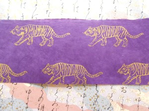
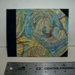
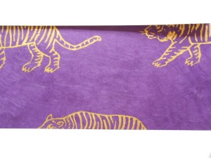
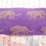
Last blog I mentioned wanting to do a book cover from some tiger patterned paper that I had.  Here’s the paper:DSCN5377It’s a long, narrow piece and I was thinking about making a very small book with just one or two tigers on the cover. As soon as I started to think about size, I realized it would never work.  Even a small book needs at least 1/2 inch turn-in on both top and bottom.  This is what the cover would look like after a normal 3/4 inch turn-in. DSCN5378 Not really what I wanted.  I can use it for endpapers, so I revamped my thinking and started looking for paper to use as covers. I found a piece of my marbled paper that goes quite well with the purple, so even though it’s not at all what I’d planned, I’m happy with the combination.
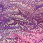
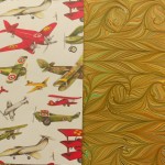
Since it’s easier to do several books at a time, I had to go on a hunt for more papers that I could become excited about.  As I sifted through stacks of paper, I came up with the following pairings.  For a change, I found good matches quite quickly.  Only the airplanes gave me a hard time, but I like the final choice.

It feels a bit strange to reverse the normal place of cover papers and marbled paper.  I like to emphasize my marbling and give it pride of place and covers use less paper than the endpapers, so I can use pieces that are too small to be inside.

I don’t know what size these books will be.  I’m thinking of trying some larger sizes for the gray-toned papers.  The largest size I make on a regular basis are 7 1/2″ x 5″, so maybe I’ll try 8″ or 8 1/2″.  I can’t do anything taller than that because of the size of my printer.  It depends also on the size of the text paper.  The sheets I start with are roughly 18″x 24″, direction short, making great 6″x 6″ pages.  I’m tired of square books though.  I frequently change my mind once faced with the text paper and having to study the cover paper to see exactly which pattern would fall on the front center.  All over patterns are so much easier than larger, poster type papers.

I may even start cutting tomorrow, I may not though!  I’m sitting watching the snow fall – very gently, but it is getting deeper.  I’m glad I don’t have to go anywhere farther than my studio!

Leave a Comment

Filed under bookbinding, Craft design, Marbled Paper

Back to Basics – Marbling and Book making

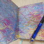
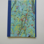
For the past few months, I’ve been consumed with the idea of making “different” books.  I’ve tried some soft covers, some Coptic bindings, some upcycling which were all fun stuff, but last week I felt the need to get back to the traditional, case-bound hard covered book. I started a batch of five and it proved to me several things.  As much fun as the other books are, I don’t feel as if they are Real books and I get more satisfaction out of making a book I know will last than the novelties.  They are fun, but transient. I can’t imagine that my hanging books or the floppy diskette books will be around in fifty years; the hard covers could be.  That said, I know I’ll still make both kinds.

These are last week’s books.

June Hard Bound

June Hard Bound

These aren’t actually finished.  They still need casing in.  The fifth book has a leather spine, so it is taking a bit longer.

As much as I enjoyed the marbling class, I felt a bit frustrated by it.  Since I was demonstrating, teaching and helping everyone, I didn’t have time to do any real work myself.  I hadn’t expected to, but still  … When I finally finished cleaning up everything and reorganizing my basement, I wanted to spend some time doing some real marbling.  Here again, I have been playing with a lot of different techniques (over-marbling, masking, figures) and wanted to go back to form and color.  One of the best things about marbling is that it’s so easy even a child can do it, yet it can take years to truly master different techniques.  Maybe like playing a drum!

Again, my last few marbling sessions have been caught up in special effects.  This time I was determined to slow down and enjoy exploring color and pattern.  Turned out to be a great idea.  I’ve had a marvelous week, in spite of the usual frustrations! Tuesday and Wednesday were unusually productive and so far I’ve produced over 50 pieces.  And that’s not counting the “tray fillers”.

Again, my basement becomes my Studio and some of the papers.

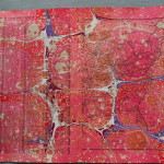
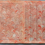
Lots of things going on here!  As you may be able to see, I tried to stay with a single color palette for several sheets, making small change in color and design from sheet to sheet.  It’s hard to tell from the pile, but there are probably five or six sheets of each colorway.  You can see it most clearly in the black set.  I used only black, grey, white and one accent color for each sheet.  I used the same pattern, but changed the size of the comb and the rake.  The feel of the piece becomes quite different.  The Dark blue set was on a very stiff card stock and is generally a mess.  I haven’t used anything that heavy in a while and it takes getting used to!  Since it doesn’t bend easily, it is very easy to catch air bubbles and the technique used to lay the paper on the marbling tray is a bit different.  As you can see from the closeup, I was also having some problems with contamination in the tray about that time.  With marbling, there is always something to keep me on my toes.

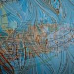
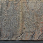
I love doing maps and did a batch from atlases, road maps and street directories.  I also cut a Pennsylvania highway map into  strips that would fill the tray when I was doing smaller pieces. Not sure what I’ll do with them, but they’ll come in useful some day.  If not, I know a number of collage artists who will use them.  My favorite map was the one of Turkey done in browns and yellows.  It reminds me so much of the time I spent there many eons ago, travelling across from Afghanistan.  Couldn’t do that now.

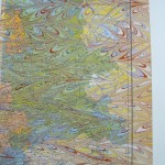
Marbling is always interesting and always a bit of a surprise.  The colors are never quite what I expect, sometimes better, sometimes not.  And there’s always that dreaded air bubble just waiting to spoil the perfect piece!

Now that summer is really here, my marbling trays will probably remained packed up.  I just have to start using up or selling all this wonderful paper so I can make more!

1 Comment

Filed under bookbinding, Craft design, Marbled Paper

A Scrap Exchange for Upcyling and Fabulous Papers

On my recent vacation, I made trips to two great places near Raleigh, N.C.  The first was to a store I have used online for years, PaperMojo.  They have an astounding array of decorative papers of all types and weights and have just opened a small brick & mortar shop in Wake Forest.  There’s nothing like being able to see and feel a paper before buying.  Textures and weight is so important in bookbinding.  I have a number of sheets I have purchased online in the past that I will probably never use simply because they are too light or too heavy or just don’t feel right.

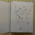
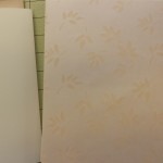
I didn’t buy much, just one sheet with leaf inclusions to use in the books I was working on and two sheets that will work very well for the soft cover style.  I don’t think I would have bought the latter online.  Here they are:

The other stop was at the Scrap Exchange, a reuse center in Durham, NC. It’s a non-profit that collects unwanted materials from businesses and individuals and sells or re-purposes them.  They have an incredibly eclectic range of items from electronics to wallpaper sample books to office supplies. I bought some odds and ends and it made me start thinking about making books from all sorts of goodies.  Here is my collection:

I have no clear idea of what I’ll do with any of these.  The plastic samples made me think of my Jacob’s Ladders. Both the vinyl floor & wall samples might become book covers as well as the wood.  The marble I’ll be using for paring leather.  If any of these work out, I’ll be looking into finding a local source.  Stayed tuned to see what happens!

In other news, I started planting the gardens – just potatoes for now, but the good stuff will come soon.

I’m giving a three-day marbling workshop next week so that will hold back the planting.  As soon as it’s over I plan to dive into it!.

Leave a Comment

Filed under bookbinding, Craft design

Maps of the Mind, Marbled, of course

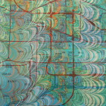
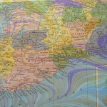
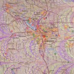
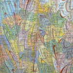
Maps are some of my favorite recycled papers to marble.  I try to use colors that complement the areas of the map – browns and rust for desserts, blues and greens over the oceans – as well as harmonize with any printed colors.  As with much in marbling, you can plan a lot, but the paints seem to have a will of their own in the end and that’s the element I find so fascinating.  The little drop of white that centers itself right over a town or the purple swirl that almost follows a coastline  or the yellow streak of marbling that happens to disappear on top of a printed red and magically appear again to lead to a river or mountain is always a surprise.

Here are a few maps I’ve marbled in the past.

In my last marbling session I did a bunch of pages from an atlas.  Because of the way books are made, when disbound the pages are not consecutive, so I had gazetteer pages facing map pages.  I had originally planned to use both pages for ladders,  but I like the maps so much that I don’t want to cut them up.  Here are some of the pages.

I’ve used my marbled maps in numerous projects: books, towers, portfolios, almost everything I make, I’ve tried it with maps.

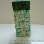
The map covered towers have been very popular, especially when I use local maps.  Eventually I will map some map ladders, but right now I’m “laddered-out” as you will see in my next blog!

1 Comment

Filed under Craft design, Marbled Paper

Shimmer & Shine

One aspect of marbling that haven’t explored much is the use of metallic paints.  I had tried some in the past with rather mediocre success and just hadn’t worked with them again.  During the class at the Campbell Folk School this fall,  I had some very successful pieces with metallic paints.

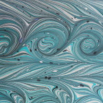
These two pieces show the use of metallics. In my last marbling session, I decided to explore their use a bit more, trying to match metallics with colors and just seeing how they reacted with other colors.

One of the first things I verified was that metallics just don’t show up well on white paper.  They tend to just look like a flat brown, orange or grey.  The colors I was playing with were gold, copper, bronze and silver.  Here are three white cards that had gold and copper on them.

As you can see, it’s hard to tell where the metallic is.  In contrast to this, here are some of the pieces I made with metallic paints using colored card stock.

The papers used for these pieces were black, royal blue, red, and purple. The gold and coppers are much clearer.  The amount of shininess depends entirely upon the amount of paint dropped.  On some of these there is way too much.  One problem that arises with metallic paint is that it granulates very quickly and has to be constantly stirred – without making bubbles!  This paint had the added problem that it was old and even more prone to coming out of suspension.  Fine for experimenting, but not the best.  That is why there are so many little “bits” of paint in the designs. These are especially noticeable on the fine lines of the get-gels.  On the purple stone piece, I decided to join rather than fight, so I left it at the stone stage without trying to do any drawing out.

I think I’ll continue working with metallic paint, in moderation.  I like the clear crisp colors a bit better, but it does have a place in my marbling palette.
1 Comment

Filed under Craft design, Marbled Paper

More Ladders

I was so pleased that I finally have the ribbons straightened out that I made a bunch more of the Ladders.  I’m especially enjoying using pages from vintage books.  The way the paper is cut, I rarely have complete paragraphs or even sentences.  It is a mind stretcher to “read” some of them.  They are not really just random words, but more like dream thoughts that never get quite completed.  I’ve cut a bunch more from cookbooks, Shakespeare and even the Bible.  I’m looking forward to putting them together.

In the meantime here are the ones I’ve finished.

All of these are for sale on Etsy.  In other news, I’m still cleaning up from my last marbling session. Marbling is fun, but it does make a mess!
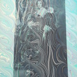
I’m still sorting out the papers and trying to decide which papers to use and which to sell. That’s always a fun enterprise.  More on those papers later … I hope!

1 Comment

Filed under Craft design, Marbled Paper

Monochromatic Rainbow

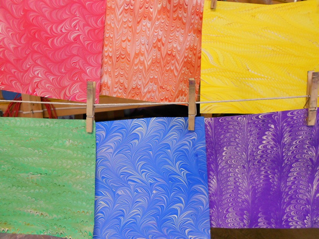
I suppose that’s actually an oxymoron, but it describes the marbling I did this weekend!  I was so impressed by the “shades of grey” piece I did at the beginning of January, that I decided to expand the repertoire. Now I have monochromatic pieces of all the primary and secondary colors; red, orange, yellow, green, blue and purple.  All I need now is to figure out how to use them!

Here’s one of each on the line.

Rainbow3

and a quick gallery of them all:

There are four sheets of each color except the blue.  I really like the fresh, clean look of these.  I plan to do more this week, but I also have other ideas. Today I also did some marbling using masks to cover portions of the paper so they don’t have paint.  They can either be left plain or overmarbled.  I hope to have those results for you by the end of this week.

Sometimes there are too many ideas for the time I have.  Decisions, decisions, decisions. As much as I love having piles of paper around, it does help if I can actually sell some or make something from them to sell.  At least it gives me money to buy more supplies.


1 Comment

Filed under Craft design, Marbled Paper

Quick “show and tell” of my last overmarbling

Why is it that when you really want spectacular results the souffle falls? At least it seems that way.  I was hoping that the few overmarbles I did in the last batch would be good demonstrations of how the technique can work.  Instead they are just some more examples of not-quite-hits.  It happens.   Next time …

Anyway I did promise to show you and here are the results, side by side.

Example 1:
The original paper is on the right, overmarbled on the left.

No alumNo alum - over

The original sheet either was missed in the alum process or was flipped and I tried to print on the wrong side.  Most of the pigment and pattern washed off in the water bath.  You can see a few traces of a nonpareil pattern on the left edge.  The remaining pigments left a pale wash over the paper.  The overmarbling used similar color in a wide, looping pattern that gained some resonance from the under pattern, but nothing outstanding. It’s a pleasant piece, but not what I hoped for.

Example 2:

Washed outWashed - over

This original piece was in pale, almost washed-out greens. This photo makes the piece look worse than it was.  It was nice, just rather wishy-washy.  I thought it might be a good candidate. I over marbled it with yellows, burnt sienna and oranges. Unfotunately, the burnt sienna granulated a bit and didn’t give the strong lines I was expecting. The undercoat gives interesting shadows and reflections, but not the “wow” factor.

Example 3:

PurplePurple - over

This piece was quite successful in bringing a rather namby-pamby piece back to life.  I’d had a problem with the yellow in the first piece pushing all the other colors and then disappearing when printed. For the over coat, I used the same colors in the same stone pattern without the yellow and obtained a very nice colorful piece.  This one is the most interesting to try and trace the under and over patterns. If you focus on the black, almost triangular shape a little to the left and above center in the first piece, you can see the same shape in the middle of a large purple stone in the second.  From there, you can trace many of the black veins and colored stones.

Example 4:

Green Green - over

This was my most successful piece of these four.  At least I think so!  The original piece was nice with a little bit of a ripple going on, but it had some flaws that would have made it hard to use.  For the overmarble, I used similar colors, but made them more intense.  I tired to echo the under pattern, without the ripple.  The ripple shows through and gives a very subtle motion to the piece.  The flaws tend to blend into the new patterns and make the piece very usable,

I’m hoping to start another marbling session this weekend and I’m excited to have just received a shipment of lots of new colors in my new paint.

In the meantime, I’m frustrating myself making some more Jacob’s ladders.  Preparing the blocks is a piece of cake.  Threading the ribbons is a whole different matter!  There always seems to be one that is not right – usually the broken rung is in the middle.  Will post more pictures when (and if) I get them right.  Doesn’t matter, I’m having fun.
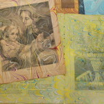
Later posts on overmarbling:  Playing  Addendum

2 Comments

Filed under Craft design, Marbled Paper