Sometimes I make books in almost a production mode, working on them every day till they are done. Other times, I do it in fits and starts, leaving them half started for a while and coming back to them after many interruptions. The last four books that I wrote about appear to fall into the latter class! I did the design work, choosing papers and then put them aside.
This week, I went back to them for the next step – choosing paper for the text block and deciding on the size and shape of the book. I didn’t do anything special with the papers this time. I’m using my standard Strathmore and Canson drawing papers. I like the weight and feel of them. I would love it if I could get them in colors, but the colored sheets tend to be heavier as well as much more expensive. I do use Pastel paper occasionally, but it has a definite “tooth” and is not right for some of my books. I also like the Strathmore “Toned Tan” and “Toned Grey” for my earthier creations and have used a lot of that in the long-stitch books.
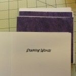
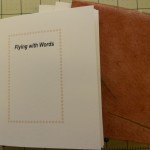
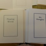
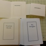
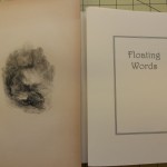
Back to the current four. After cutting the text paper, I print a title page, verso and colophon. Most blank books don’t have titles, but I like adding them. I think it makes them more like real books. My titles range from the pedestrian My Journal, to the whymiscal Wish on a Fish. They tend to reflect the color, Purple Prose, or content, Purring Thoughts, of the book’s cover. These titles were more of the pedestrian variety. Here the pages have been cut and folded and the titles printed.
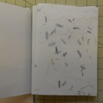
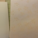
The two larger books are almost the same size. The smaller one was cut to fit the tiger endpapers and the medium sized one was determined by the cover design. The pages are folded and gathered into sections or gatherings, ready to be punched and sewn. I like to add an extra ornamental page of light weight paper around the even sections, just to add a little something special. Here are the papers I chose for the larger books.
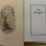
I also added frontispieces to the two larger books. These are illustrations that were taken from two different books from 1840-1850. The books were badly damaged and had fallen apart, but I was able to rescue some of the engravings. The illustrations are not copies, they are the real thing. As you can see in the photo, they need to be trimmed down and tipped in. I’ll do this by leaving a narrow edge that will fold around the back of the title page. The flap will be glued in, but it will also be sewn into the first gathering, making it an integral part of the book. Sometimes, when the paper is too brittle to fold or is smaller than the book, I just tip it in opposite the title.
My next steps will be to attach the frontispieces and sew all of the textblocks. In the meantime, I have learned to put all parts of each book into a separate plastic bag! Before I did this consistently, I would switch papers mid-stream and discover I had to cut paper all over again to match the new configurations!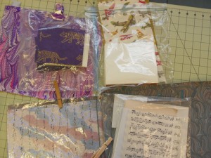
The reason I didn’t move on to sewing the textblocks was that I was sidetracked by note cards, which will be my next blog. I hope to get to it soon.
I have written at length about all the processes in making a book on other pages on this site, starting here.

